Quintin and Ruth Blair Residence, Cody, Wyoming (1952) (S.351)
Exterior Photographs By Douglas M. Steiner, August 2009
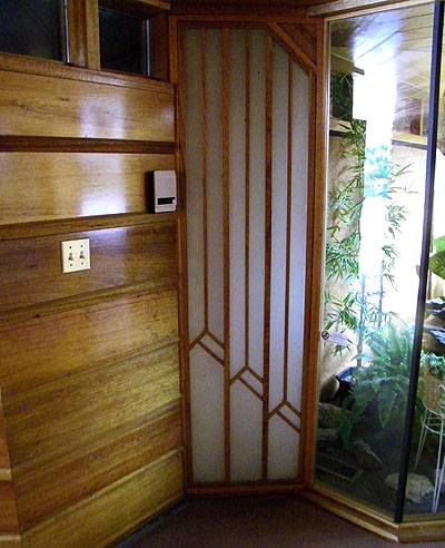
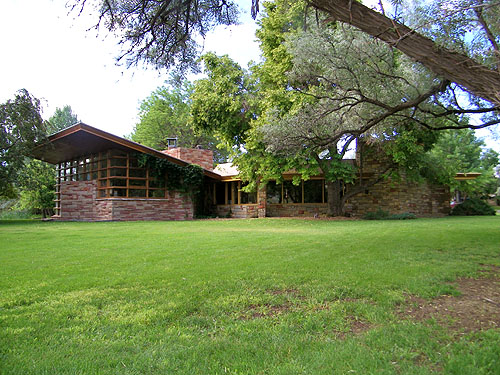
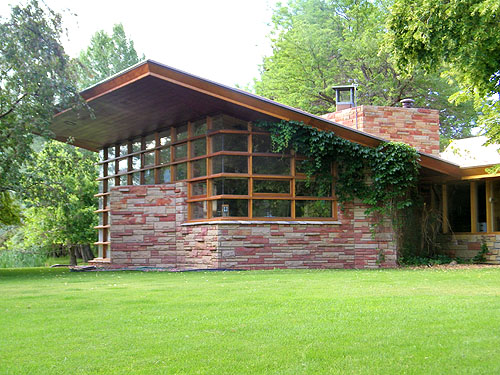
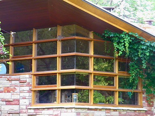
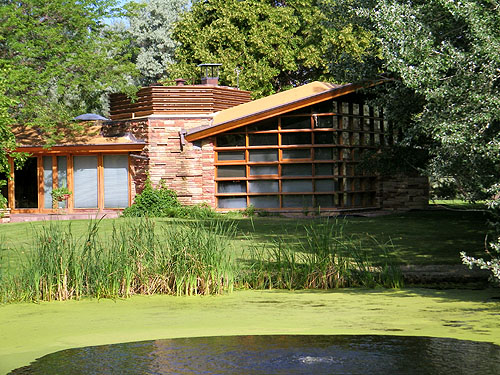
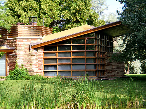
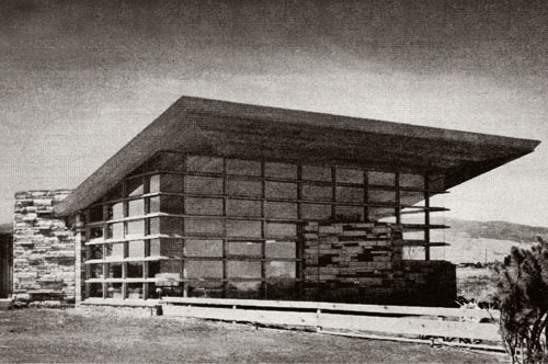
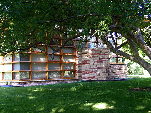
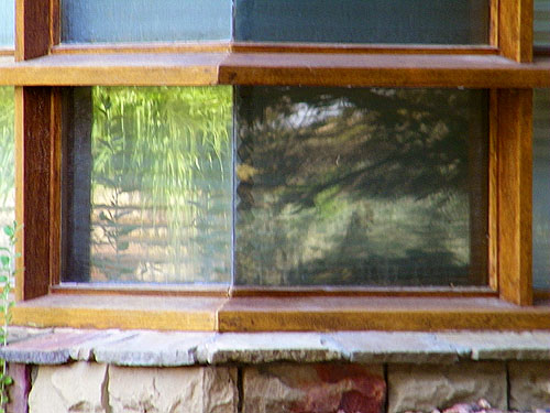
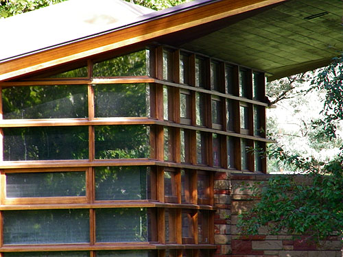
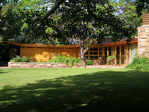
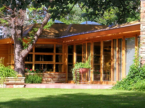
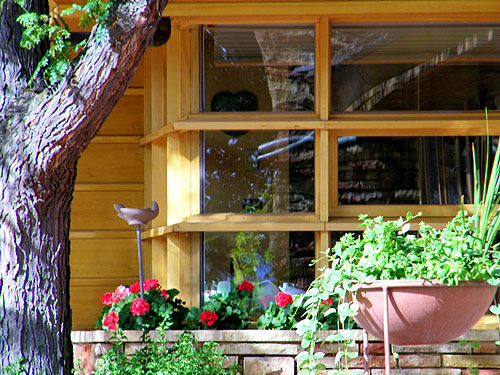
There are many classic Wright details in the two bedroom home. Three sides of the Living and Dining Room are walls of glass, one and a half of which are floor to ceiling. There are windows with mitered corners. The Living Room roof cantilevers out eight feet. The original carport had a roof that cantilevers out 12 feet. There are built in shelves, seating and lighting. The centrally located fireplace has a mantle that extends out at a 45 degree angle. There are horizontal rows of floor to ceiling vertical door and windows, double doors that open outward, clerestory windows, cut-wood light screens. And a hidden entrance.
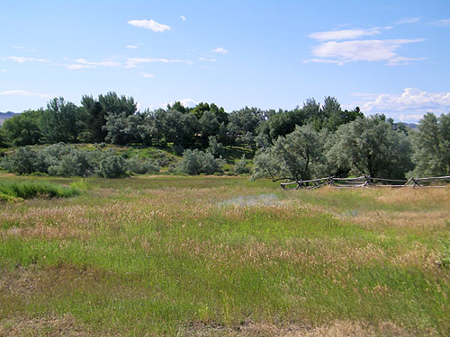
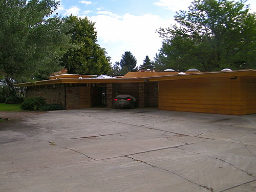
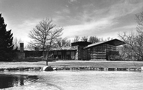
Changes and additions have taken place over theyears. They hired Bruce Goff, the architect that introduced Ruth to Wright, to enclose the terrace and create a dining room, enlarge the kitchen, and add a two car garage. According to Randolph C. Henning, the Blair residence (to the best of his recollection), is the only time the architectural genius of both Wright & Bruce Goff physically came together in an architectural work. He also mentioned that Michael Kreps was the Bruce Goff apprentice who was responsible for the drawings for the 1981 additions. After Bruce passed away, Charles Montooth was hired to design a master bedroom. 1: The Blairs purchased a large tract of land a few miles east of Cody. They began planting a wide variety of trees, which today is barely visible from the road. View is looking South toward the residence.
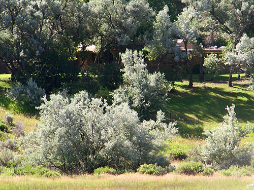
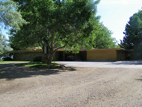
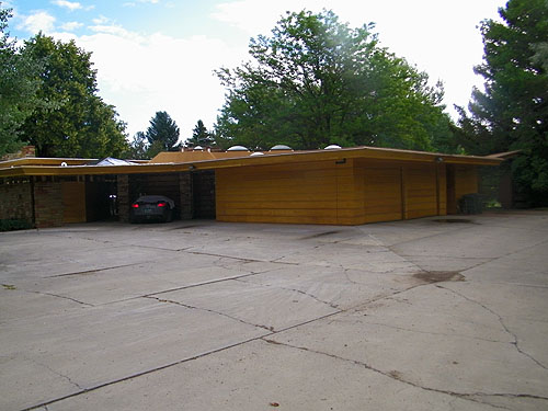
2: Viewing the property today, with all its lush vegetation, it is hard to image how barren and desolate it look in 1952. 3: Viewed from the Southwest as you approach the home. The Master Bedroom on the left and Garage on the right were later additions and not part of Wright's original design. 4: Viewed from the Southwest. The Garage on the right was not part of Wright's original design and was a later addition.
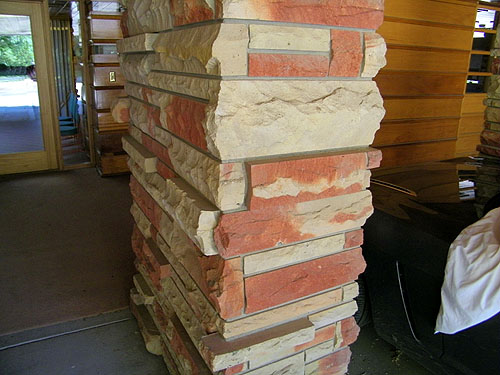
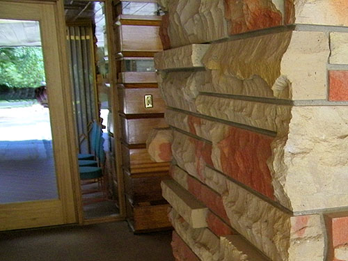
5: Viewed from the Southwest. The Master Bedroom on the left was not part of Wright's original design and was a later addition. The Entry is to the left of the stone columns.
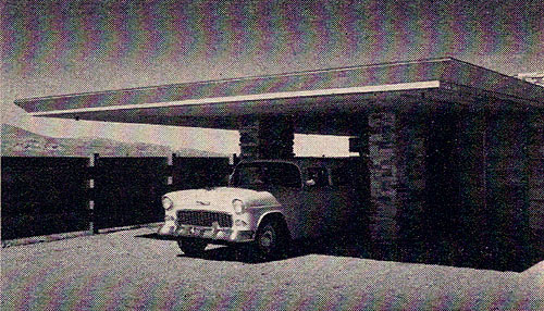
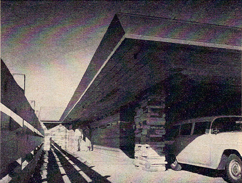
6: This view is similar to the image angle below which was photographed in 1956. Photographed in 1956 before the Master Bedroom and Garage were added. It accentuates the design of Wright's cantilevered Carport. The Entry was to the left of the stone columns. Copyright June 1956, Household Magazine, Reynolds Photography, Inc.
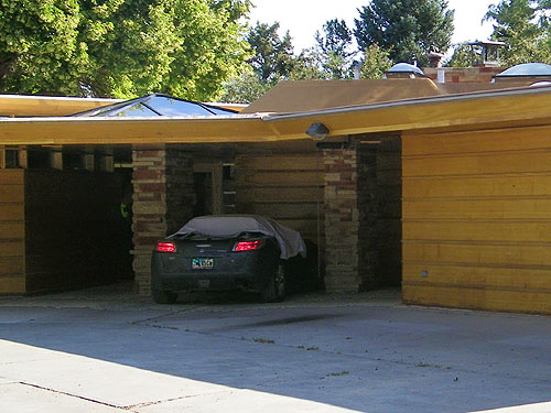
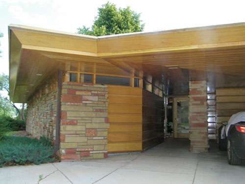
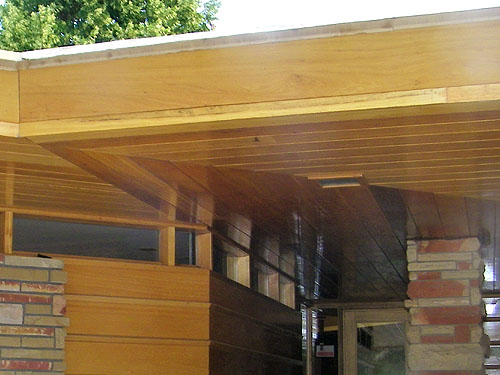
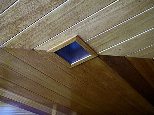
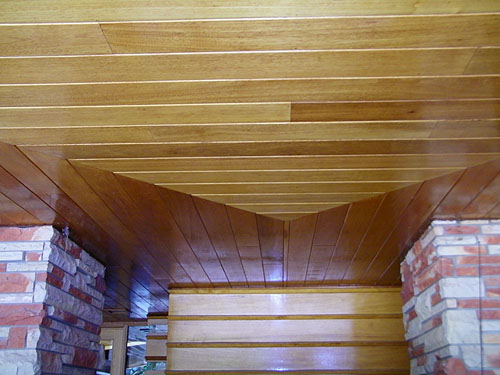
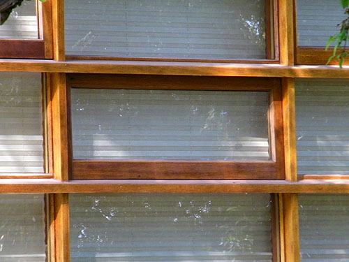
7: The Entry was moved forward, an Atrium and Master Bedroom were added. 7b: This shows the original roofline and design detail of the ceiling in the carport. The built-in light fixture and the column on the right are original. The Master Bedroom on the left and the Atrium were additions. 8: This view is similar to the image angle below which was photographed in 1956. The original bedroom is to the right of the front door. There is an upper and lower row of cut-wood light screen windows with mitered glass corners. Photographed in 1956 before the Master Bedroom was added. The entry was past the Bedrooms on the right and adjacent to the Living Room. Copyright June 1956, Household Magazine, Reynolds Photography, Inc. 8b: Detail: The original bedroom is to the right of the front door. There is an upper and lower row of cut-wood light screen windows with mitered glass corners.
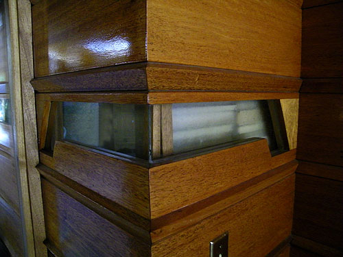
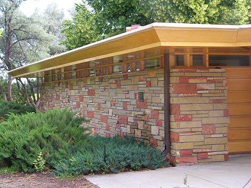
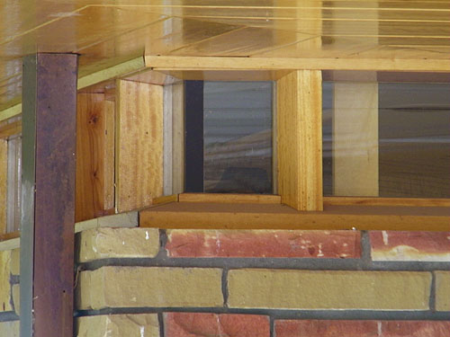
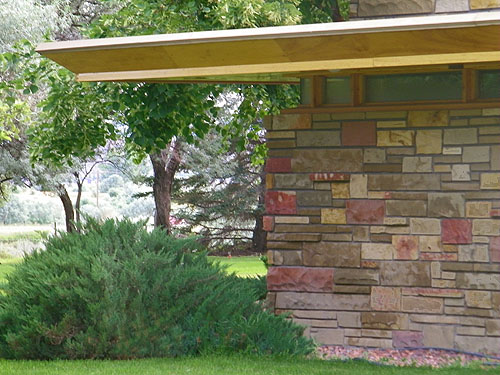
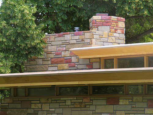
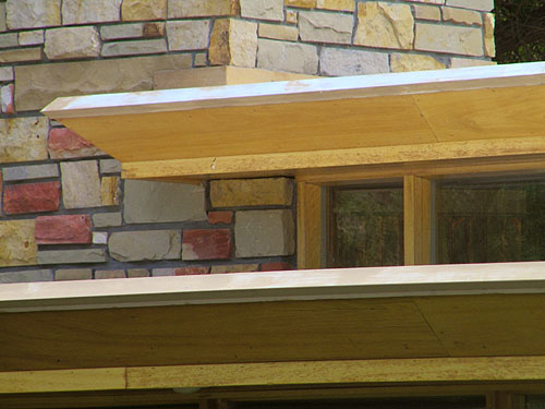
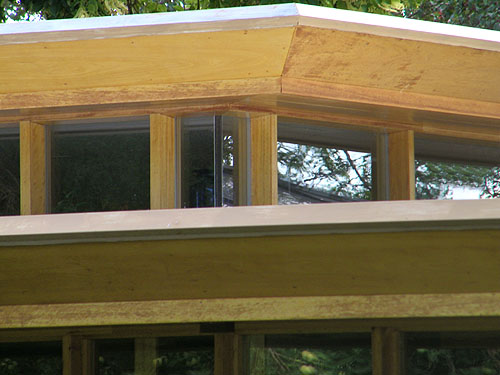
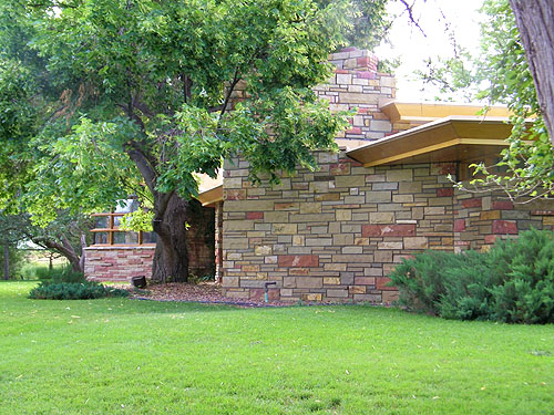
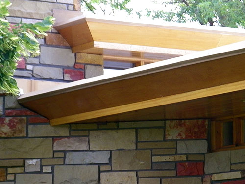
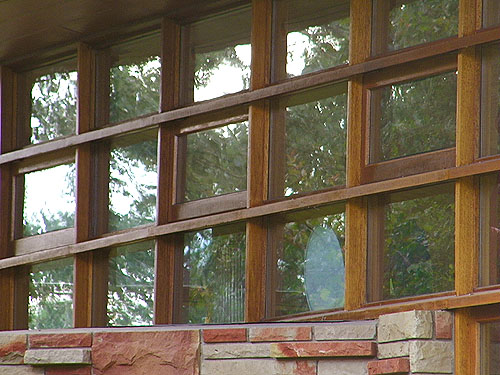
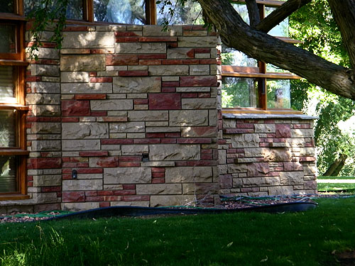
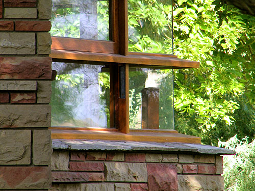
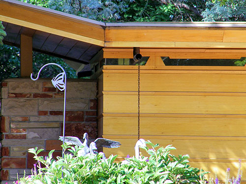
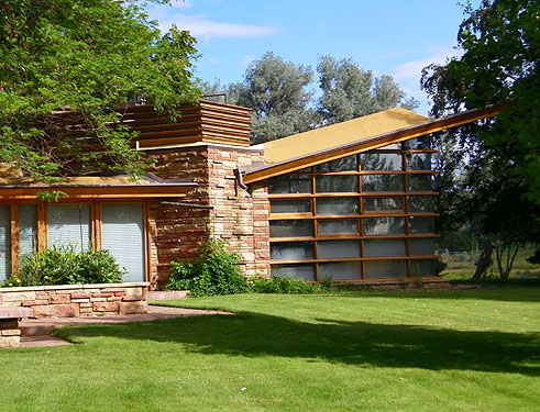
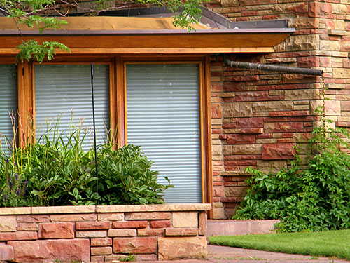
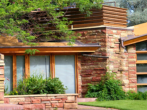
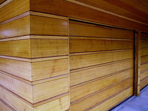
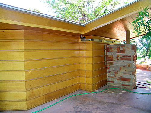
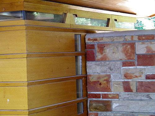
9: Western corner of the bedroom. Detail of the exterior paneling and lower row of cut-wood light screen window with mitered glass corner. 10: Original built-in light fixture in the carport ceiling. 11: Ceiling design in the carport. 12: The Master Bedroom is on the left, Light screen and Atrium to the right. The Front Door is just to the right (out of the photograph). 13: Master Bedroom viewed from the West. As we continue in a clockwise direction, the continuity of Wright's original design is maintained. Consistency of material. Broad overhangs. 13b: Detail of the Western corner of the Master Bedroom. The exterior wood paneling of the original Bedrooms allowed for an upper and lower row of cut-wood light screen windows. The addition of the Master Bedroom followed the stone and window design of the Living Room, including mitered glass corners. 14: Although Wright did not include raised clerestory windows in the original design, it was a constant theme in many of his designs and was picked up in the addition of the Master Bedroom. 14b: Detail of the broad overhand of the roof line. 14c: Detail of the raised clerestory windows and massive stone fireplace in the Master Bedroom. 14d: Detail of the raised clerestory windows in the Master Bedroom. 14e: Detail of the clerestory glass cornered window. 15: Viewed from the West. As you move past the massive stone fireplace you see the original Living Room for the first time. The Master Bedroom is on the right. 15b: Detail of the roof line intersecting the stone work.
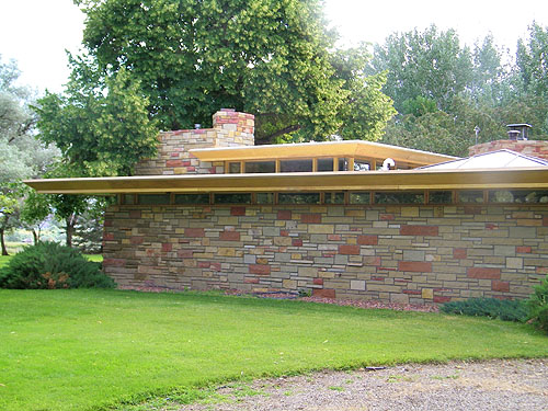
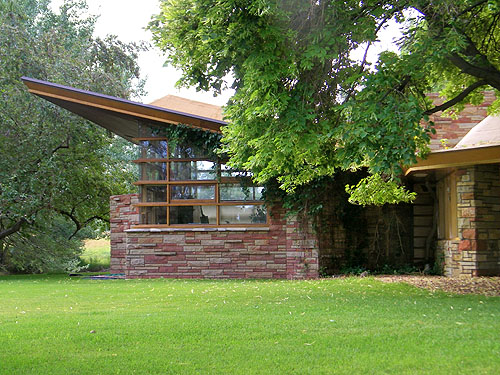
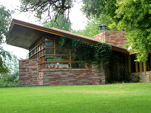
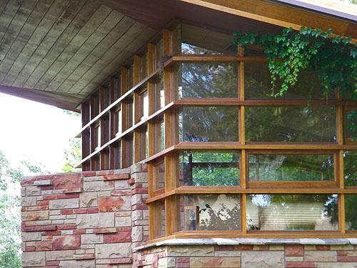
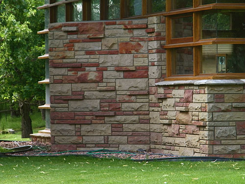
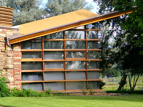
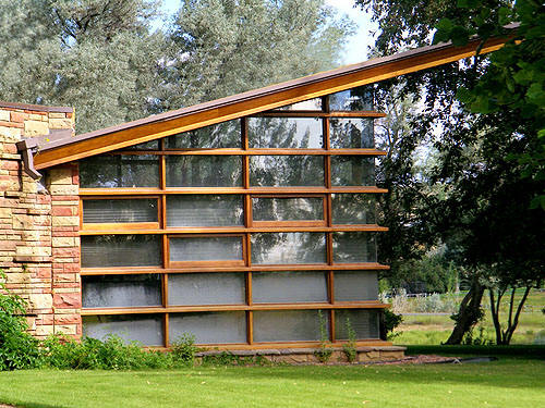
16: Viewed from the Northwest. The roof seems to float above the Living Room. The piano alcove extends out on the left. The mitered glass windows on the left allow you to see right through the corner of the Living Room. Built in shelves cover the interior of the short wall. Built in seating and shelves cover the interior of the wall that extends out on the right side of the Living Room. The Master Bedroom is on the far right. 17: Viewed from the North Northwest. The roof seems to float above the Living Room. The piano alcove extends out on the left. Built in shelves cover the interior of the short wall. Built in seating and shelves cover the interior of the wall that extends out on the right side of the Living Room. The stonework from the massive fireplace and Utility Room can be seen above the Living Room on the right. The Master Bedroom is on the far right. 17b: The roof cantilevers out past the Living Room's glass wall. The piano alcove extends out on the left. The mitered glass windows dissolve the corners of the Living Room. Some windows open outward to allow air into the Living Room. 18: Viewed from the North. The roof seems to float above the Living Room. The piano alcove extends out on the left. Built in shelves cover the interior of the short wall. Built in seating and shelves cover the interior of the wall that extends out on the right side of the Living Room. The stonework from the massive fireplace and Utility Room can be seen above the Living Room on the right. The Master Bedroom is on the far right. 18b: The roof seems to float above the Living Room. The piano alcove extends out on the left. Built in shelves cover the interior of the short wall. Built in seating and shelves cover the interior of the wall that extends out on the right side of the Living Room. The stonework from the massive fireplace and Utility Room can be seen above the Living Room on the right. The Master Bedroom is on the far right. 18c: The roof seems to float above the Living Room. The piano alcove extends out on the left. Built in shelves cover the interior of the short wall. The mitered glass windows dissolve the corners of the Living Room. Some windows open outward to allow air into the Living Room. 18d: Some windows open outward to allow air into the Living Room. 18e: The piano alcove extends out on the left. Built in shelves cover the interior of the short wall. 18f: The piano alcove extends out on the left. Built in shelves cover the interior of the short wall. The mitered glass windows dissolve the corners of the Living Room.
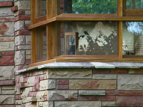
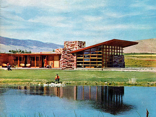
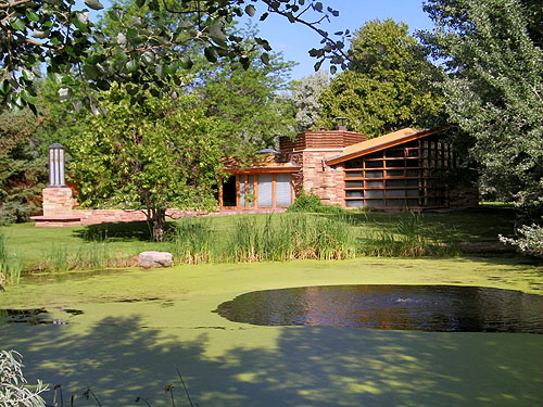
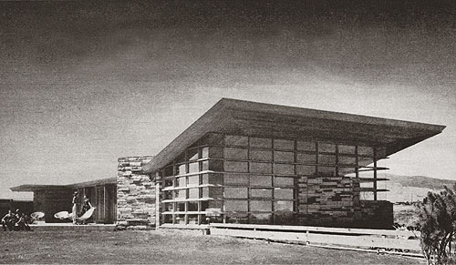
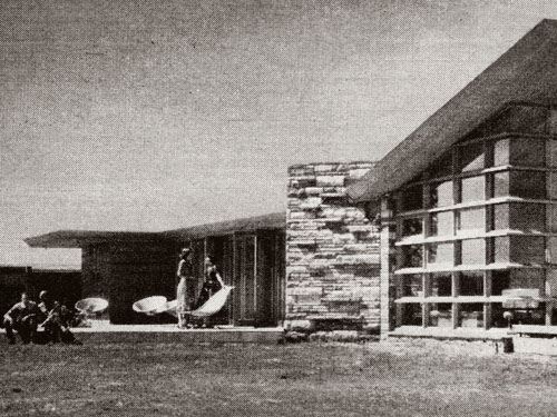
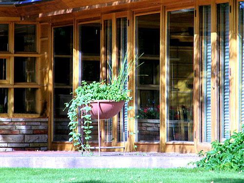
Photographed in 1956. Viewed from the East. The Workshop is on the far left, the enclosed Terrace with floor to ceiling windows and doors that open outward is in the center. Originally designed as a Hallway and Terrace, the roof was extended outward and the Terrace enclosed, later to be used as the dining room. The ceiling was deeply coffered with skylights. Just to the right is the Workspace (Kitchen) covered in stonework. A window faces the enclosed Terrace. The Dining and living room are on the right. This view accentuates Wright's cantilevered roof over the Living and Dining Room. Copyright June 1956, from the cover of Household Magazine, Reynolds Photography, Inc. 19: Viewed from the East. The large stained glass light fixture on a pedestal is from the demolished Yellowstone Canyon Hotel. The original Workshop on the far left, is obscured from view. The enclosed Terrace with floor to ceiling windows and doors that open outward is in the center. Originally designed as a Hallway and Terrace, the roof was extended outward, the Terrace enclosed and is now used as the dining room. The ceiling was deeply coffered with skylights. Just to the right is the Workspace covered in stonework. A window faces the enclosed Terrace. The original Dining and Living Room are on the right. Circs 1990s, Copyright State of Wyoming, National Registry of Historic Places. 19b: The enclosed Terrace with floor to ceiling windows and doors that open outward is on the left. Originally designed as a Hallway and Terrace, the roof was extended outward, the Terrace enclosed and is now used as the dining room. The ceiling was deeply coffered with skylights. The Workspace covered in stonework is in the center. A window faces the enclosed Terrace. The enclosure on the roof of the Workspace was added to obscure upgraded utilities. The flat roofs were structurally redesigned. The original Dining and living room are on the right. 19c: The Workspace covered in stonework is on the left. A window faces the enclosed Terrace. The enclosure on the roof of the Workspace was added to obscure upgraded utilities. The flat roofs were structurally redesigned. The original Dining and living room are on the right. The roof cantilevers out over the floor to ceiling wall of glass. The piano alcove extends out on the right. Photographed in 1956. Viewed from the East. The Workshop is on the far left, the roof is cantilevered. The enclosed Terrace with floor to ceiling windows and doors that open outward is just to the right. Just to the right of the Terrace is the Workspace covered in stonework. The Dining and Living Room are on the right. This view accentuates Wright's cantilevered roof, the walls of glass, and the 45 degree angle of the Workspace and piano alcove. The dramatic angle of the Workshop is lessened with the revisions. Copyright June 1956, Household Magazine, Reynolds Photography, Inc. Detail: This view accentuates Wright's cantilevered roof, the walls of glass, and the 45 degree angle of the Workspace and piano alcove. The mitered glass windows dissolve the corners of the Living Room. Copyright June 1956, Household Magazine, Reynolds Photography, Inc. 19d: The same angle as above is now partially obscured by mature trees planted by the Blairs. The roof cantilevers out over the floor to ceiling wall of glass. The piano alcove extends out on the right. 19e: Detail of the lower left mitered glass corner window. 19f: The roof cantilevers out over the floor to ceiling wall of glass. The roofs were structurally redesigned. The piano alcove extends out on the right. 19g: The piano alcove extends out at a 45 degree angle. Built in shelves cover the interior of the short wall on the right. 19h: The piano alcove is on the left. The mitered glass windows dissolve the corners of the Living Room. Built in shelves cover the interior of the short wall on the right. 19i: Some windows are designed to open outward to allow fresh air into the Living Room.
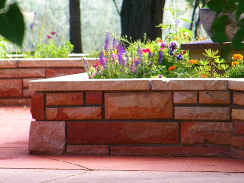
Photographed in 1956. Viewed from the East. The Workshop is on the far left, the roof is cantilevered. The enclosed Terrace with floor to ceiling windows and doors that open outward is just to the right. Just to the right of the Terrace is the Workspace covered in stonework. The Dining and Living Room are on the right. Copyright June 1956, Household Magazine, Reynolds Photography, Inc. 20: Viewed from the East. The Storage on the left is an addition, but the originally designed board and batten styled siding was retained. The original Workshop which in now in the center, was converted to the Kitchen, and the board and batten siding was replace by windows. A stone planter was added along the base of the windows. The enclosed Terrace with floor to ceiling windows and doors that open outward is to the right of the Kitchen. The original Workspace covered in stonework is on the far right. It was been converted to a Library. 20b: This Storage area is an addition, but the originally designed board and batten styled siding was retained. The slanted roof on the left matches the pitch of the Living Room. The row of cut-wood light screen windows are consistent with the upper row in the Entry. 20c: The original Workshop on the left, was converted to the Kitchen and the board and batten siding was replace by windows. A stone planter was added along the base of the windows. The enclosed Terrace with floor to ceiling windows and two sets of doors that open outward is to the right. 20d: The original Workshop was converted to the Kitchen and the board and batten siding was replace by windows. A stone planter was added along the base of the windows. 20e: The original Workshop which was converted to the Kitchen is on the left. The enclosed Terrace with floor to ceiling windows and two sets of doors that open outward is to the right. 21: Viewed from the Southeast. The enclosed Terrace with floor to ceiling windows and doors that open outward is on the left. Originally designed as a Hallway and Terrace, the roof was extended outward, the Terrace enclosed and is now used as the dining room. The ceiling was deeply coffered with skylights. The stone planter was an addition. The original Workspace, covered in stonework has been converted to a Library. A window faces the enclosed Terrace. The enclosure on the roof of the Workspace was added to obscure upgraded utilities. The flat roofs were structurally redesigned. The original Dining and living room are on the right. 21b: The enclosed Terrace with floor to ceiling windows and doors that open outward is on the left. Originally designed as a Hallway and Terrace, the roof was extended outward, the Terrace enclosed and is now used as the dining room. The ceiling was deeply coffered with skylights. The stone planter was an addition. The original Workspace, covered in stonework is on the right. 21c: The enclosed Terrace with floor to ceiling windows and doors that open outward is on the left. Originally designed as a Hallway and Terrace, the roof was extended outward, the Terrace enclosed and is now used as the dining room. The ceiling was deeply coffered with skylights. The stone planter was an addition. The original Workspace, covered in stonework has been converted to a Library. A window faces the enclosed Terrace. The enclosure on the roof of the Workspace was added to obscure upgraded utilities. The original Dining and living room are on the right. 21d: The original Dining and living room are on the right. The mitered glass windows dissolve the corners of the Living Room. The flat roofs were structurally redesigned. 21e: Through the magic of Photoshop we are able to envision Wright's original design. When removing the structural changes (i.e. the enclosure above the Workspace and the changes to the roof), the cantilevered roof floats above a wall of glass. The mitered glass windows dissolve the corners of the Living Room. 22: The Terrace was expanded and stone planters were added.
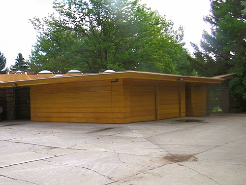
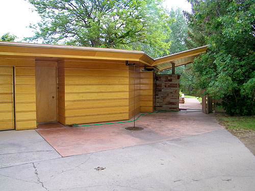
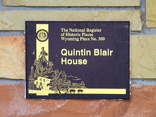
23: Viewed from the Southwest. The original Carport is on the far left. The Garage in the center and storage on the right were not part of Wright's original design and were later additions. The originally designed board and batten styled siding was retained. 23b: The Garage was not part of Wright's original design and was a later addition. The originally designed board and batten styled siding was retained. 23c: The Garage, on the far left, and storage on the right were not part of Wright's original design and were later additions. The slanted roof on the right matches the pitch of the Living Room. The row of cut-wood light screen windows are consistent with the upper row in the Entry. The originally designed board and batten styled siding was retained. 23d: The storage areas were not part of Wright's original design and were later additions. The slanted roof on the right matches the pitch of the Living Room. The row of cut-wood light screen windows are consistent with the upper row in the Entry. The originally designed board and batten styled siding was retained. 23e: The storage areas were not part of Wright's original design and were later additions. The row of cut-wood light screen windows are consistent with the upper row in the Entry. The originally designed board and batten styled siding was retained. 24: While Ruth was probably the impetus for selecting Wright, Quintin was just as involved in the process. Like many of Wright’s clients, he supervised the construction himself. The Blair House was placed on the National Register of Historic Places in 1991.
Text and Photographs by Douglas M. Steiner, Copyright 2009
BACK
HOME ARTIFACTS AUDIO BOOKS PERIODICALS PHOTOS POSTCARDS POSTERS STAMPS STUDIES ASSISTING ABOUT SEARCH
SEARCH WEB SITE To donate or pass on information, comments or questions: info@wrightlibrary.com ©Copyright 2001, 2014
