SUPPORT
THE WRIGHT LIBRARYPROCEEDS FROM EVERY SALE GOES TO SUPPORT THE WRIGHT LIBRARY.
CLICK TO ORDER.
WE PROUDLY SUPPORT THE FRANK LLOYD WRIGHT BUILDING CONSERVANCY
WE PROUDLY SUPPORT FALLINGWATER
AND THE WESTERN PENNSYLVANIA CONSERVANCY
THURBER ART GALLERIES (1909 - S.154) INTRODUCTION FINE ARTS BUILDINGS PLANS FLOOR PLAN INTERIOR OF THE GALLERIES ART GLASS & SKYLIGHTS
FURNITURE ADVERTISEMENTS BOOKS & ARTICLES ADDITIONAL WRIGHT STUDIESDate: 1909
Title: Thurber Art Galleries Elevations and Plans 1909 (1909 - S.154).
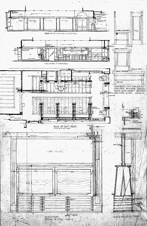
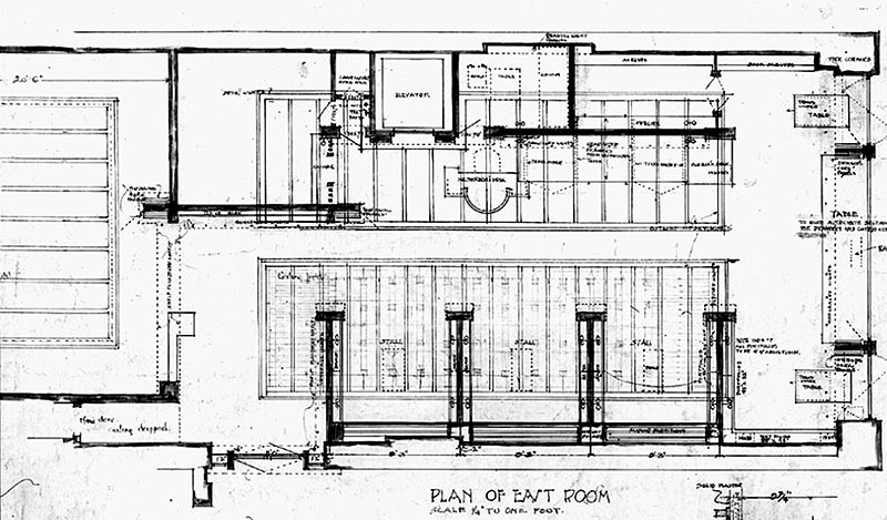
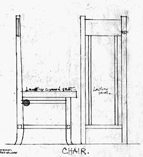
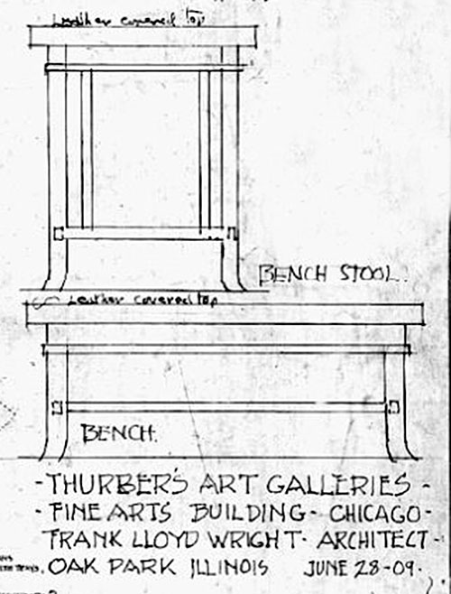
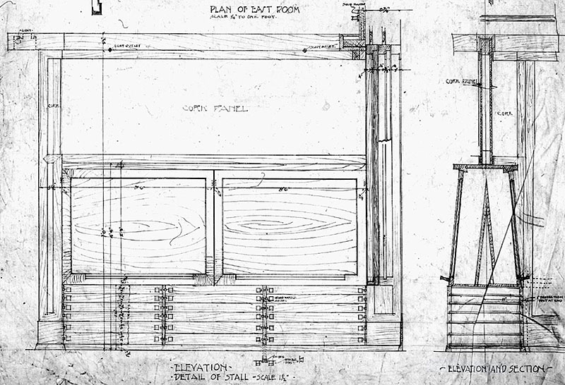
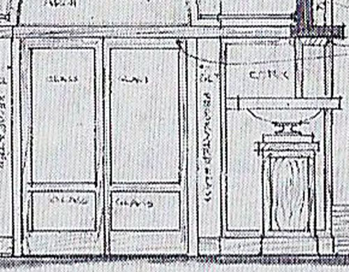
Description: Elevations, plan and details of the furniture for the Thurber Art Galleries designed by Frank Lloyd Wright in 1909. Top left: “Elevation of South Wall of East Room. Elevation of North Wall.” Top right: “Chair. Bench Stool. Bench.” Center: “Plan of East Room.” Text center right: “Thurber’s Art Galleries. Fine Arts Building, Chicago. Frank Lloyd Wright, Architect. Oak Park, Illinois., June 23, 09.” Bottom left and right: “Elevation. Detail of Stall. Elevation and Stall.” Frank Lloyd Wright Foundation #0911.001. Courtesy of the Frank Lloyd Wright Archives, Avery Architectural Library. See Additional Information...
Size: 8 x 10 B&W photograph.
S#: 0086.32.0622Date: Circa 1910
Title: Thurber Art Galleries circa 1910 (1909 - S.154).
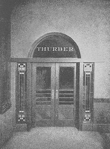
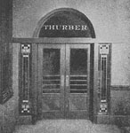
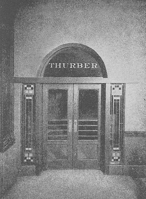
Description: Historic Photograph #1: Exterior hallway view of entrance to the Thurber Art Galleries designed by Frank Lloyd Wright in 1909. Located on the fifth floor of the Annex Building, which is adjacent to the Fine Arts Building on the North side, facing Michigan Avenue. Where the Fine Arts Building has ten floors, the Annex has five. Glass, an element Wright brilliantly utilized in his designs, engulfed the Entryway of the Thurber Art Galleries. Single stained glass panels adorned either side of the double glass doors in the entrance. A single circular piece of glass topped the Entrance. Wright used dull grayed white glass, rich yellow and a few small squares of black. All were set in brass leadings of various widths. Copy photograph published in The Book of The Fine Arts Building, 1911/2008, page 19. See Additional Information...
Size: 4 x 5 B&W photograph.
S#: 0094.95.0522Date: Circa 1909 Title: Thurber Art Galleries (1909 - S.154), circa 1909
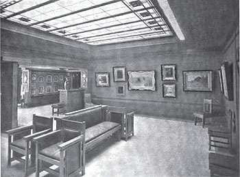
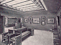
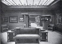
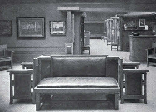
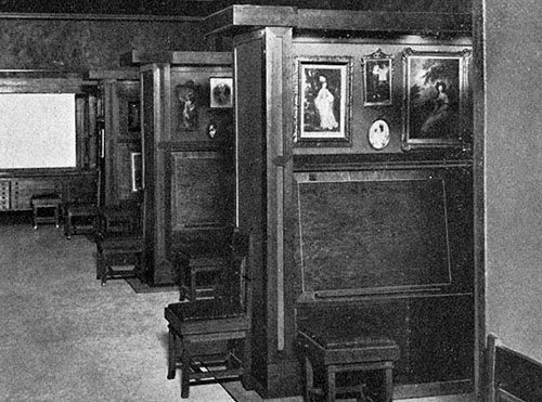
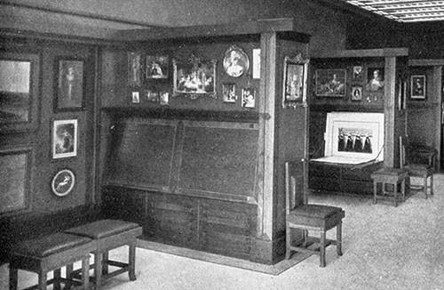
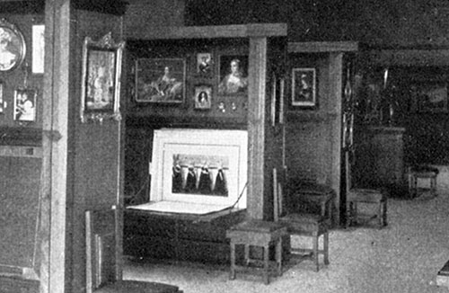
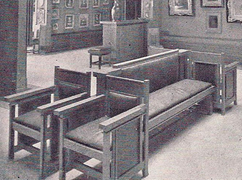
Description: Historic Photograph #2: View of the smaller Viewing Gallery looking toward the Southwest. The woodwork was of fumed oak, with bronze worked into the grain and inlaid with a line of white holly. The floors were designed especially to reflect the light, composed of white magnasite. Around the edge of the floor was a band of dull yellow-toned magnasite, bringing the golden wall color down into the floor. The two colors were divided by a narrow strip of inlaid brass. The walls of both galleries were covered with cork gilded in a low-toned bronze dadoed by a higher-keyed gilded rough plaster. Each gallery had a skylight, composed of oblong pieces of dull grayed white glass, with smaller oblong pieces of rich yellow and a few small squares of black, set in brass leadings of various widths, and were different in each gallery. The furniture was designed by Wright. Photographed by Published in "International Studio", February, 1910. See Additional Information...
Size: 10 x 7.4 B&W Print
S#: 0086.05.0911
Date: Circa 1910 Title: Thurber Art Galleries (1909 - S.154), circa 1910
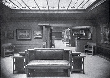
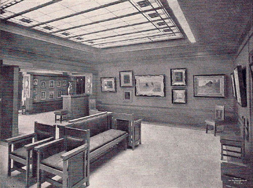
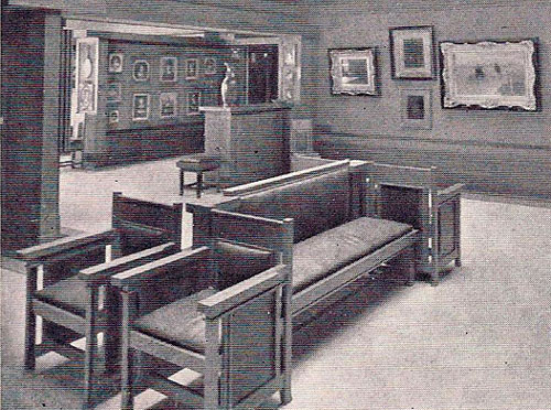
Description: Historic Photograph #3: View of the smaller Viewing Gallery looking East toward Lake Michigan. The floors were designed especially to reflect the light, composed of white magnasite. Around the edge of the floor was a band of dull yellow-toned magnasite, bringing the golden wall color down into the floor. The two colors were divided by a narrow strip of inlaid brass. The walls of both galleries were covered with cork gilded in a low-toned bronze dadoed by a higher-keyed gilded rough plaster. Each gallery had a skylight, composed of oblong pieces of dull grayed white glass, with smaller oblong pieces of rich yellow and a few small squares of black, set in brass leadings of various widths, and were different in each gallery. The furniture was designed by Wright. Published in "International Studio", April, 1911. See Additional Information...
Size: 10 x 7.2 B&W Print
S#: 0094.17.0911
Date: Circa 1910 Title: Thurber Art Galleries (1909 - S.154), circa 1910
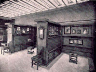
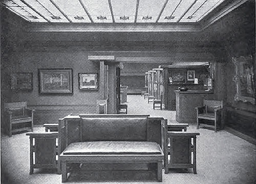
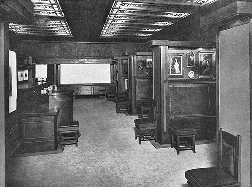
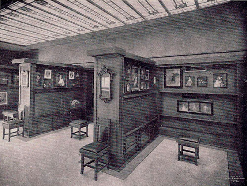
Description: Historic Photograph #4: View of the larger Print and Reproduction Gallery looking East toward Lake Michigan. Wright "carefully considers every detail of room size and height, the lighting by day and night, placing of doors and windows, the breaking up of the wall surfaces, the design and use of each piece of furniture..." (International Studio) The built-in portfolio booths were seven and one-half feet high and include portfolio screens, drawer space, tables, desks and seats. There were no fixtures of any sort. Electric lights were placed above the skylights and concealed in the portfolio booths, so that the source of light was hidden, diffused and softened "as to have the effect of daylight". Each gallery had a skylight, composed of oblong pieces of dull grayed white glass, with smaller oblong pieces of rich yellow and a few small squares of black, set in brass leadings of various widths. The furniture was designed by Wright. Photographed by Henry Fuermann and Company. Published in "Frank Lloyd Wright, Ausgeführte Bauten", 1911. See Additional Information...
Size: 10 x 7.4 B&W Print
S#: 0094.18.0911
Date: Circa 1909 Title: Thurber Art Galleries (1909 - S.154), circa 1909
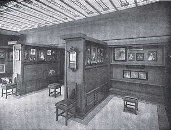
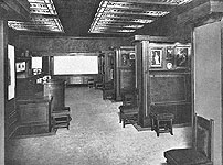
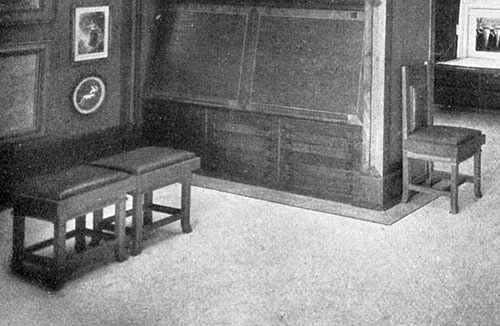
Description: Historic Photograph #5: View of the built-in portfolio booths in the larger Print and Reproduction Gallery. They were seven and one-half feet high and included viewing spaces, desks that fold up and down, drawer spaces, and innovative viewing portfolio screens that slid up and down within the wall on the right. There were no fixtures of any sort. Electric lights were concealed in the portfolio booths, so that the source of light was hidden and diffused. The furniture was designed by Wright. Published in "International Studio", February, 1910. See Additional Information...
Size: 10 x 7.6 B&W Print
S#: 0086.06.0911
Date: Circa 1910 Title: Thurber Art Galleries (1909 - S.154), circa 1910
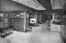
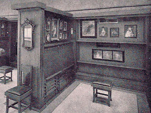
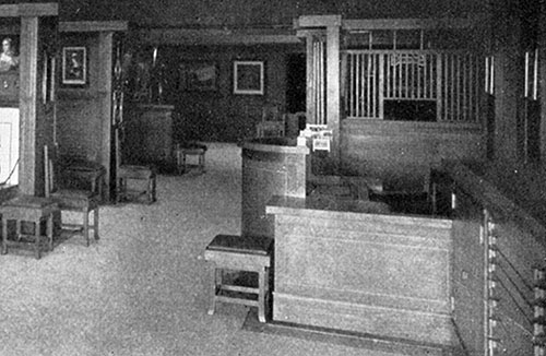
Description: Historic Photograph #6: View of the larger Print and Reproduction Gallery looking West. Wright "carefully considers every detail of room size and height, the lighting by day and night, placing of doors and windows, the breaking up of the wall surfaces, the design and use of each piece of furniture..." (International Studio) The built-in portfolio booths were seven and one-half feet high and include portfolio screens, drawer space, tables, desks and seats. There were no fixtures of any sort. There were electric lights placed above the skylights and concealed in the portfolio booths, so that the source of light was hidden, diffused and softened. This larger gallery had two skylights, composed of oblong pieces of dull grayed white glass, with smaller oblong pieces of rich yellow and a few small squares of black, set in brass leadings of various widths. The furniture was designed by Wright. Photographed by Henry Fuermann and Company. Published in "Frank Lloyd Wright, Ausgeführte Bauten", 1911. See Additional Information...
Size: 10 x 6.5 B&W Print
S#: 0094.19.0911
Date: 1981 Title: Thurber Art Galleries Print File (1909 - S.154), 1981.
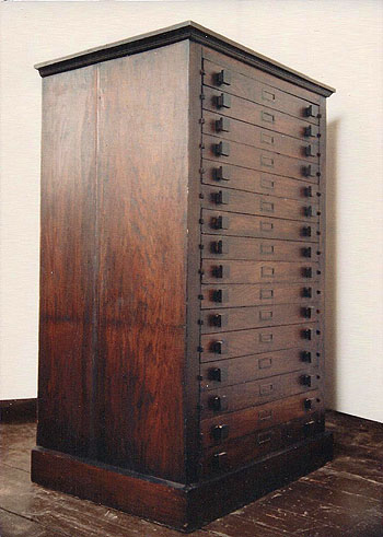
Description: Oak Flat Print File for the W. Scott Thurber Art Galleries, Chicago, designed by Frank Lloyd Wright Circa 1909. Three quarter view facing forward and slightly to the right. Rectangular print file cabinet with overhanging edge and molding around the base. Sixteen narrow, slatted drawers, with square pulls and projecting drawer slides. On December 13-14, 1996, this cabinet sold at Christie’s, New York, Sale 8540, Lot 416, for $23,000 plus buyer’s premium. 53 (H) x 34.25 (W) x 25.25 (D). Acquired from Kelmscott Galleries. See Additional Information...
Size: Five 4 x 5 Color photographs.
ST#: 1981.130.0413
Date: 1981 Title: Thurber Art Galleries Print File (1909 - S.154), 1981.
Description: Oak Flat Print File for the W. Scott Thurber Art Galleries, Chicago, designed by Frank Lloyd Wright Circa 1909. Three quarter view facing forward and to the right. Rectangular print file cabinet with overhanging edge and molding around the base. Sixteen narrow, slatted drawers, with square pulls and projecting drawer slides. Hand written on verso: "Frank Lloyd Wright Thurber Galleries." On December 13-14, 1996, this cabinet sold at Christie’s, New York, Sale 8540, Lot 416, for $23,000 plus buyer’s premium. 53 (H) x 34.25 (W) x 25.25 (D). Acquired from Kelmscott Galleries. See Additional Information...
Size: Five 4 x 5 Color photographs. Additional seven detailed Polaroid photographs.
ST#: 1981.131.0413
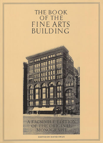
Date: 2008 (1911) Title: The Book of the Fine Arts Building, A Facsimile Edition of the Original Monograph (Soft Cover) (Originally published in 1911 for the Corporation of the Fine Arts Building by Ralph Fletcher Seymour Co., Chicago. 1000 copies were printed on paper, 25 copies on Imperial Japan Vellum. This facsimile edition published by The Hyoogen Press, Inc., Chicago)
Author: Peattie, Elia W.; Edited by Swan, David
Description: "Foreward (1911). The recent publication in ‘The International Studio,’ the foremost art publication in America, of the article on the Fine Arts building which is reproduced in the following pages, as well as the numerous printed commendations which had from time to time since the inception of the enterprise shown an extended and continued public interest in the building... The Fine Arts Building, including within its walls, as it does, the most important of the artist, musical, educational and literary interests of the city..." Includes an interior and exterior photograph of the second Browne’s Bookstore on the first floor, as well as two photographs of the Thurber Art Galleries, the entrance and interior. Original list price $20.00. 8.5 x 11.75.
Pages: Pp 37
S#: 2008.08.0111
Date: 2014
Title: Thurber Art Galleries Space, Fine Arts Building Annex, Chicago, Illinois 2014 (1909 - S.154).
Description: Set of 18 photographs of the space originally used by the Thurber Art Galleries. Photographed on January 10, 2014. During a trip to Chicago, we decided to visit the Fine Arts Building, locate the space originally used by the Thurber Art Galleries and investigate whether any details remained of Frank Lloyd Wright’s original design. It was on the fifth floor of the Annex Building, which is adjacent to the Fine Arts Building on the North side, facing Michigan Avenue. Where the Fine Arts Building has ten floors, the Annex has five. We took the elevator, still manually controlled by an elevator operator, to the fifth floor. The doorway into the fifth floor of the Annex Building is still arched... Continue...
Size: Set of 18 high res 20 X 13.5 digital images.
ST#: 2014.55.0522Date: 2016
Title: Thurber Art Galleries Adaptation of Entrance 1909/2016 (1909 - S.154).
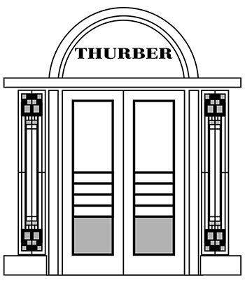
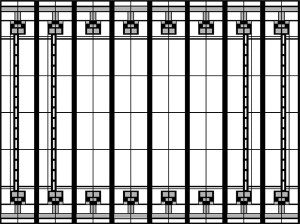
Description: Adaptation #1: Adaptation of the exterior hallway entrance to the Thurber Art Galleries designed by Frank Lloyd Wright in 1909. Wright's design itself becomes the art at the Thurber Art Galleries. Located on the fifth floor of the Annex Building, which is adjacent to the Fine Arts Building on the North side, facing Michigan Avenue. Glass, an element Wright brilliantly utilized in his designs, engulfed the Entryway of the Thurber Art Galleries. Single stained glass panels adorned either side of the double glass doors in the entrance. A single circular piece of glass topped the Entrance. Wright used dull grayed white glass, rich yellow and a few small squares of black. All were set in brass leadings of various widths. Adapted and illustrated by Douglas M. Steiner, 2016. See Additional Information...
Size: 8 x 10 B&W photograph.
ST#: 2016.56.0522Date: 2016
Title: Thurber Art Galleries Adaptation of Painting Gallery Ceiling Art Glass 1909/2016 (1909 - S.154).
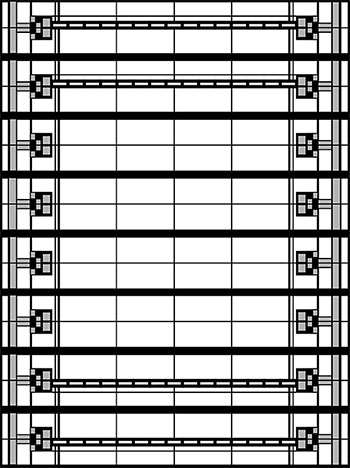
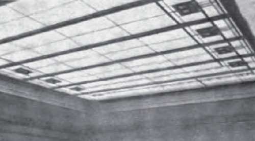
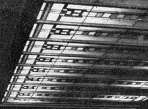
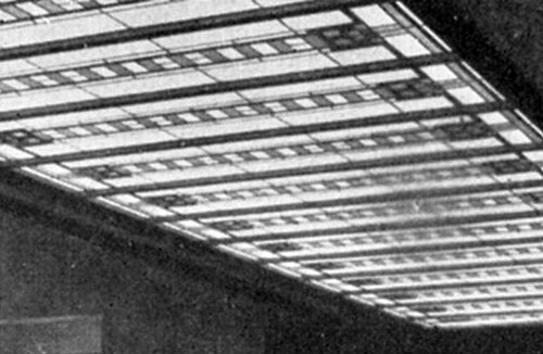
Description: Adaptation #2: Adaptation of the ceiling art glass in the Painting Gallery designed by Frank Lloyd Wright in 1909. The smaller viewing gallery included one large Skylight containing eight panels. The two panels on the left and two on the right appeared to be consistent. The four panels in the center appeared to be a simplified version of the pattern. They were composed of oblong pieces of dull grayed white glass, with smaller oblong pieces of rich yellow and a few small squares of black, set in brass leadings of various widths. Adapted and illustrated by Douglas M. Steiner, 2016. See Additional Information...
Size: 8 x 10 B&W photograph.
ST#: 2016.57.0522Date: 2016
Title: Adaptation #3: Thurber Art Galleries Adaptation of Print and Reproduction Gallery Ceiling Art Glass Panel 1909/2016 (1909 - S.154).
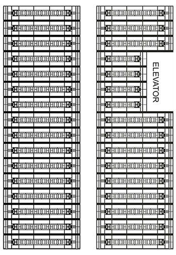
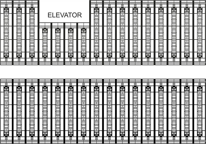
Description: Adaptation of the ceiling art glass panel in the Print and Reproduction Gallery designed by Frank Lloyd Wright in 1909. The larger viewing gallery included two large skylights containing 16 panels each. All 32 panels appear to be consistent, except for the four panels above the elevator. They were composed of oblong pieces of dull grayed white glass, with smaller oblong pieces of rich yellow and a few small squares of black, set in brass leadings of various widths. Adapted and illustrated by Douglas M. Steiner, 2016. See Additional Information...
Size: 3 x 10 B&W photograph.
ST#: 2016.59.0522Date: 2016
Title: Thurber Art Galleries Adaptation of Print and Reproduction Gallery Ceiling Art Glass 1909/2016 (1909 - S.154).
Description: Adaptation #4: Adaptation of the ceiling art glass in the Print and Reproduction Gallery designed by Frank Lloyd Wright in 1909. The larger viewing gallery included two large skylights containing 16 panels each. All 32 panels appear to be consistent, except for the four panels above the elevator. They were composed of oblong pieces of dull grayed white glass, with smaller oblong pieces of rich yellow and a few small squares of black, set in brass leadings of various widths. Adapted and illustrated by Douglas M. Steiner, 2016. See Additional Information...
Size: 8 x 10 B&W photograph.
ST#: 2016.58.0522Date: 2016
Title: 5) Adaptation #5: Thurber Art Galleries Adaptation of the Floor Plan 1909/2016 (1909 - S.154).
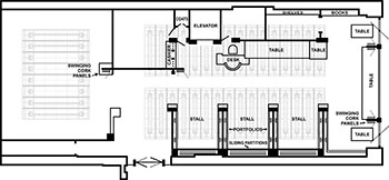
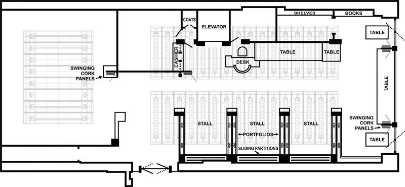
Description: Adaptation of the floor plan for the Thurber Art Galleries designed by Frank Lloyd Wright in 1909. The Thurber Art Galleries consisted of the smaller Painting Gallery on the left and the larger Print and Reproduction Gallery on the right. Adapted and illustrated by Douglas M. Steiner, 2016, from Wright's original drawing and is a simplified representation. See Additional Information...
Size: 10 x 6 B&W photograph.
ST#: 2016.60.0522Date: 2016
Title: 6) Adaptation #6: Thurber Art Galleries Composite of Floor Plan and Photographs 1909/2016 (1909 - S.154).
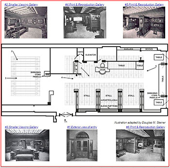
Description: Adaptation of the floor plan and historic photographs of the Thurber Art Galleries designed by Frank Lloyd Wright in 1909. The Thurber Art Galleries consisted of the smaller Painting Gallery on the left and the larger Print and Reproduction Gallery on the right. To date, six original photographs have been located. This illustration combines the floor plan and six photographs. Adapted and illustrated by Douglas M. Steiner, 2016, from Wright's original drawing. See Additional Information...
Size: 8.5 x 8.5 Color photograph.
ST#: 2016.61.0522Date: 2019
Title: Thurber Art Galleries Oak Chair 2019 (1909 - S.154).
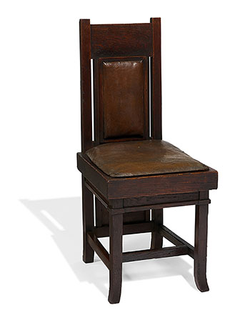
Description: Perspective view of a Thurber Art Galleries oak and leather chair designed by Frank Lloyd Wright in 1909. Three quarter view facing forward and to the right. Constructed of oak, seat and back partially covered in leather. This chair can be seen throughout the Galleries in the original photographs. On June 9, 2019, this chair was sold by Toomey & Company, Oak Park. 35.75 (H) x 15.5 (W) 17.5 (D). Courtesy of Toomey & Company. See Additional Information...
Size: 8 x 10 Color photographs.
ST#: 2019.49.0622Date: 2019
Title: Thurber Art Galleries Oak Chair 2019 (1909 - S.154).
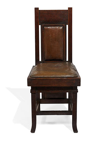
Description: Front view of a Thurber Art Galleries oak and leather chair designed by Frank Lloyd Wright in 1909. Constructed of oak, seat and back partially covered in leather. This chair can be seen throughout the Galleries in the original photographs. On June 9, 2019, this chair was sold by Toomey & Company, Oak Park. 35.75 (H) x 15.5 (W) 17.5 (D). Courtesy of Toomey & Company. See Additional Information...
Size: 8 x 10 Color photographs.
ST#: 2019.50.0622Date: 2019
Title: Thurber Art Galleries Oak Chair 2019 (1909 - S.154).
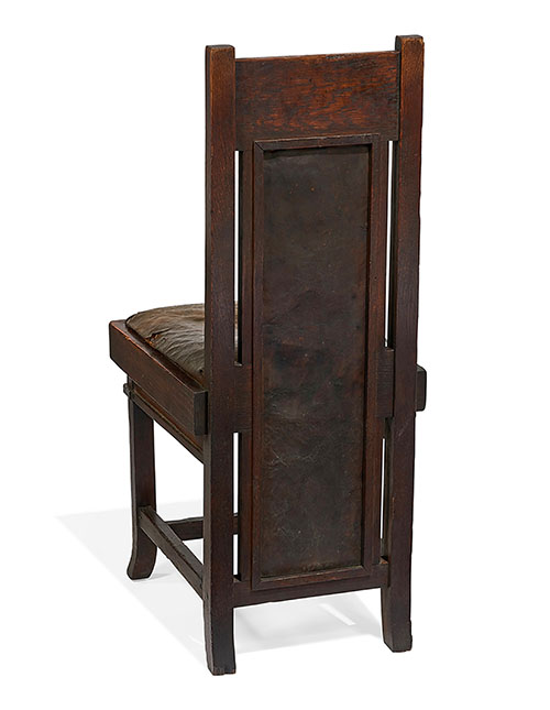
Description: View of the back of a Thurber Art Galleries oak and leather chair designed by Frank Lloyd Wright in 1909. Constructed of oak, cushion and back partially covered in leather. This chair can be seen throughout the Galleries in the original photographs. On June 9, 2019, this chair was sold by Toomey & Company, Oak Park. 35.75 (H) x 15.5 (W) 17.5 (D). Courtesy of Toomey & Company. See Additional Information...
Size: 8 x 10 Color photographs.
ST#: 2019.51.0622THURBER ART GALLERIES (1909 - S.154)
Winfield Scott Thurber was born in St. Lawrence County, New York on July 24, 1848. He attended Gouveneur Seminary in St. Lawrence County, New York, and Bryant & Stratton Business College in Ogdensburg, New York. He married Martha C. Chord and had two children, Harriett and Aimee.
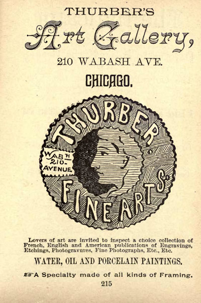
He began his career as a salesman at the O'Brian Gallery, Chicago's first fine art Gallery. He formed the Thurber Art Gallery in 1880 at 210 Wabash Avenue in downtown Chicago. From an ad in 1885, he exhibited Water, Oil and Porcelain Paintings, and "a choice collection of French, English and American publications of Engravings, Etchings, Photogravures, Fine Photographs" and Frames.
In 1909 Thurber commissioned Frank Lloyd Wright to design a Gallery for his new space in the Fine Arts Building, which occupied the entire fifth floor of the adjoining annex on Michigan Avenue. Whether due to the configuration of the space, or intentional, it consisted to two Galleries. The larger Print and Reproduction Gallery, and the smaller Viewing Gallery. Wright titled his drawings "Thurber's Art Galleries" dated June 28 - 09. When Thurber opened his new space, the name reflected the change to "The Thurber Art Galleries".
Just after it opened, the International Studio reviewed Wright's work in their extensive February, 1910 exposé. "In Mr. Frank Lloyd Wright's architectural treatment one recognizes a close study of Japanese refinement and elimination, with a slight touch of the modern German and Viennese Secessionist influence in decorative construction. He carefully considers every detail of room size and height, the lighting by day and night, placing of doors and windows, the breaking up of the wall surfaces, the design and use of each piece of furniture, without losing sight of the minor points of utility which must, of course, govern the major artistic conception.
The woodwork is of fumed oak, with bronze worked into the grain and inlaid with a line of white holly. The floors are designed especially to reflect the light, being of white magnasite, a fine texture of cement. All around the edges of the center white portion, divided from it by a narrow strip of inlaid brass, is a band of dull yellow-toned magnasite, bringing the golden side-wall color down into the floor. In all the galleries the walls are covered with cork gilded in a low-toned bronze dadoed by a higher-keyed gilded rough plaster. The gilt is so low in key and the cork of such exquisite texture that it forms a perfect background for pictures, and seems to enhance any mellowness of color that an oil or water color might possess.
The built-in furniture and portfolio booths are all carried to a height of seven and one-half feet in the print and reproduction gallery; and this space is again divided into various sections, forming portfolio screens, drawer space, tables, desks and seats, each part having its proper space relation to every other and so making a restful picture. Each gallery has its skylights, these being composed of oblong pieces of dull grayed white glass, with smaller oblong pieces of rich yellow and a few small squares of black -- all this set in brass leadings of various widths. Thedesigns are different in each gallery and the white note in the floors, while the yellow emphasizes and enriches the general dull gilt color scheme. The artificial light is especially interesting. There are no fixtures of any sort in view, there being a large number of electric lights placed above the skylights and concealed in the architectural construction, so that the source of light is every where hidden and yet the light itself is perfectly diffused and so softened as to have the effect of daylight." International Studio, February, 1910.
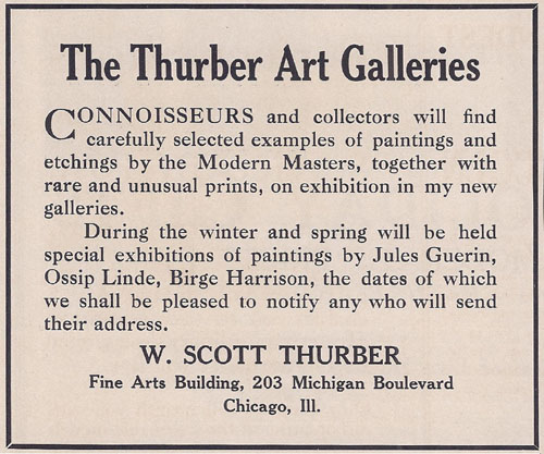
Thurber Art Galleries hosted exhibitions of well know artists. In an advertisement placed in the same issue of International Studio, "Connoisseurs and collectors will find carefully selected examples of painting and etchings by the Modern Masters, together with rare and unusual prints, on exhibition in my new galleries. During the winter and spring will be held special exhibitions of paintings by Jules Guerin, Ossip Lind, Birge Harrison..."
In 1911 he held an exhibition for American Artist Jerome Blum and Lawrence Mazzanovich. He gained a reputation dealing mostly in European and American paintings and prints in a conservative style, but Thurber's was also the city's most progressive gallery. He introduced Chicago to the works of the early Modernists. In 1912 he created quite a stir, leaving a lasting mark, by exhibiting the radical abstract work of Arthur Dove. Like Frank Lloyd Wright in the field of Architecture, W. Scott Thurber was a driving force in his field of exhibiting artists and artwork.
He made annual trips to abroad, visiting art centers throughout European, establishing acquaintances with leading artists around the world. It might be said that W. Scott Thurber was as much a influence in bringing fine art to Chicago, as Frank Lloyd Wright was in the field of architecture.
Sadly, after just three to four years working in his Wright designed galleries, W. Scott Thurber pasted away on September 24, 1913 at the age of sixty-five. He had planned many more years in the building. Records indicate that in 1909 he signed a ten year lease. The December, 1916 issue of "Arts and Decoration" reported that Mrs. W. Scott Thurber had passed away. The business continued in operation, under the management of Seymour J. Thurber, the president of Thurber Art Galleries, most likely his son.
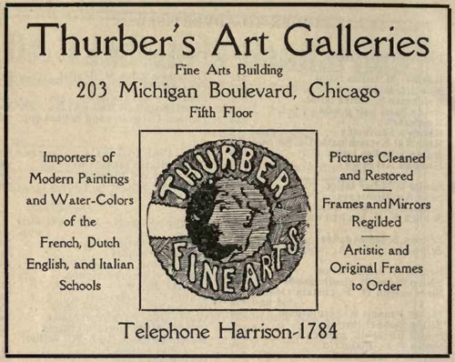
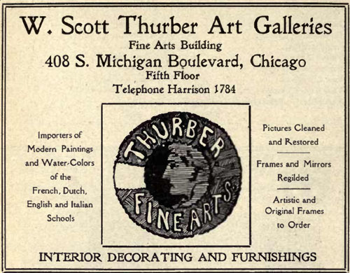
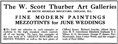
Advertisements in 1914 publicize The W. Scott Thurber Art Galleries, "Importers of Modern Paintings and Water-Colors of French, Dutch, English and Italian Schools... We limit our selections to such examples as conform to the high standard which controls all or our buying. We have fine examples of the rare works of S. Arlent Edwards and Sidney Wilson as well as the best plates of Clifford James, Richard Smythe, Alfred Skrimshire, H. T. Greenhead, Elizebeth Gulland, E. E. Milner, G. G. Stevenson, George P. James, Percy Martindale, John Cother Webb, and the complete work of Fred Millar."
Thurber Art Galleries moved out of the Fine Arts Building in 1917, according to Carla Lind, and Wright's work was most likely destroyed shortly thereafter.
September 2011.FINE ARTS BUILDING, CHICAGO
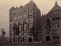
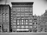
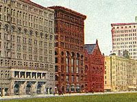
Located adjacent to the Auditorium Building on Michigan Avenue, the Fine Arts Building was originally The Studebaker Building, a carriage factory and showroom. By 1895, the building proved insufficient, and the Studebakers decided to convert the building into studios and theaters to be an artistic and literary center. The renovated ten story building opened in the summer of 1898. It soon became a hub for writers, artists, musicians, publishers, galleries, societies and Wright himself, from 1908 through 1910. It became known as "the first art colony in Chicago". Wright's interest in publishing and Japanese prints lead him to become a member of The Caxton Club which was located on the tenth floor of the building. Both Francis Fisher Browne and Wright were members. Wright's interest in publishing limited edition books went back to 1896 with his involvement in "The Eve of St. Agnes" and "The House Beautiful" 1896-1898. Another member of the Caxton Club was publisher Ralph Fletcher Seymour who located his publishing company in The Fine Arts Building. In 1911, he published "The Morality of Women" for Wright and Mamah Bouton Borthwick (Cheney) as well as two other volumes. In 1912 Seymour published Wright's first edition of "The Japanese Print".
Another tenant in the Fine Arts Building was The Arts Club of Chicago. Wright held an Exhibition there of Japanese Prints entitled "Antique Colour Prints From The Collection of Frank Lloyd Wright" beginning November 12 and ending December 15, 1917.
"The Dial", a semi-monthly journal of Literary criticism, discussion and information, founded by Francis Fisher Browne also had offices in the Fine Building.
Wright's first project in the Fine Arts Building was Browne's Bookstore on the seventh floor for Francis Fisher Brown, (1907 - S.141). Wright's second and third projects were the Thurber Art Galleries (1909 - S.154) which occupied the entire fifth floor of the annex building, and the Mori Oriental Art Studio (1914 - S. 181) on the eighth floor.
Wright must have been pleased with the outcome of Thurber Galleries, because he included two images in "Frank Lloyd Wright, Ausgeführte Bauten", 1911, pages 109. Continued...
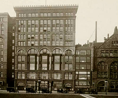
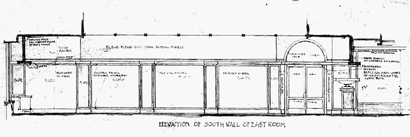
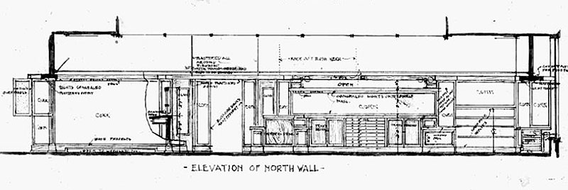
Fine Arts Building and Annex Circa 1915. The annex was remodeled by 1909 when Wright designed the Thurber Art Galleries, which occupied the entire fifth (top) floor of the annex. The annex remains consistent today. Photographed by J. W. Taylor, Chicago, Circa 1915. PLANS 2) Detail of the "Elevation of South Wall of East Room." 3) Detail of the "Elevation of North Wall." 4) Detail of the "Plan of East Wall."
5) Detail of the "Chair." 6) Detail of the "Bench Stoof and Bench." Text:"Thurber’s Art Galleries. Fine Arts Building, Chicago. Frank Lloyd Wright, Architect. Oak Park, Illinois., June 23, 09." 7) Detail of the “Elevation. Detail of Stall." "Elevation and Stall.” FLOOR PLAN
(Adaptation #5) Adaptation of the floor plan for the Thurber Art Galleries designed by Frank Lloyd Wright in 1909. The Thurber Art Galleries consisted of the smaller Painting Gallery on the left and the larger Print and Reproduction Gallery on the right. Adapted and illustrated by Douglas M. Steiner, 2016, from Wright's original drawing and is a simplified representation. (S#2016.60.0522)
INTERIOR OF THE THURBER ART GALLERIES
Few photographs remain, documenting the eight short years of the Thurber Art Galleries. The best record is the extensive reviewed of Wright's work in the February, 1910 issue of International Studio. "He carefully considers every detail of room size and height, the lighting by day and night, placing of doors and windows, the breaking up of the wall surfaces, the design and use of each piece of furniture, without losing sight of the minor points of utility.
The woodwork is of fumed oak, with bronze worked into the grain and inlaid with a line of white holly. The floors are designed especially to reflect the light, being of white magnasite, a fine texture of cement. All around the edges of the center white portion, divided from it by a narrow strip of inlaid brass, is a band of dull yellow-toned magnasite, bringing the golden side-wall color down into the floor. In all the galleries the walls are covered with cork gilded in a low-toned bronze dadoed by a higher-keyed gilded rough plaster. The gilt is so low in key and the cork of such exquisite texture that it forms a perfect background for pictures, and seems to enhance any mellowness of color that an oil or water color might possess.
The built-in furniture and portfolio booths are all carried to a height of seven and one-half feet in the print and reproduction gallery; and this space is again divided into various sections, forming portfolio screens, drawer space, tables, desks and seats, each part having its proper space relation to every other and somaking a restful picture. Each gallery has its skylights, these being composed of oblong pieces of dull grayed white glass, with smaller oblong pieces of rich yellow and a few small squares of black -- all this set in brass leadings of various widths. The designs are different in each gallery and the white note in the floors, while the yellow emphasizes and enriches the general dull gilt color scheme. The artificial light is especially interesting. There are no fixtures of any sort in view, there being a large number of electric lights placed above the skylights and concealed in the architectural construction, so that the source of light is every where hidden and yet the light itself is perfectly diffused and so softened as to have the effect of daylight." International Studio, February, 1910.
Wright designed an innovative viewing portfolio screens that slid up and down within the wall, tripling the wall viewing space.
Wright must have been pleased with the outcome of Browne's Bookstore, because he included two images in "Frank Lloyd Wright, Ausgeführte Bauten", 1911, page 109.
Whether due to the configuration of the space, or intentional, it consisted to two Galleries. The larger Print and Reproduction Gallery, and the smaller Viewing Gallery. Wright titled his drawings "Thurber's Art Galleries" dated June 28 - 09. When Thurber opened his new space, the name reflected the change to "The Thurber Art Galleries".Intfp
#2 Smaller Viewing Gallery
Illustration adapted by Douglas M. Steiner
#3 Smaller Viewing Gallery
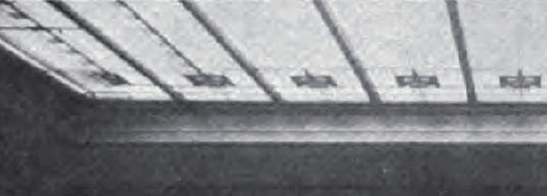
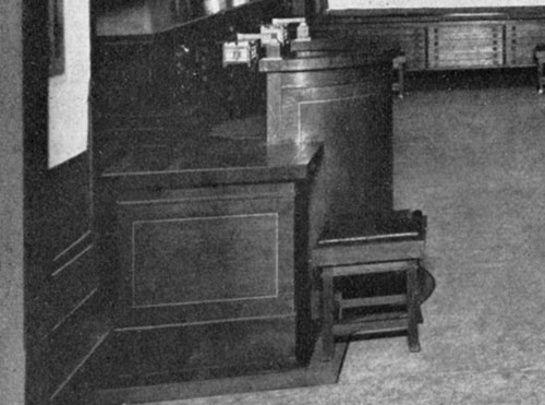
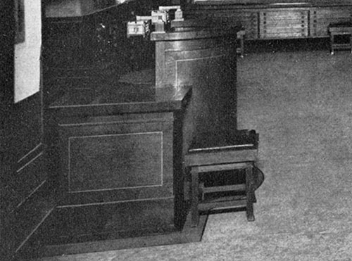
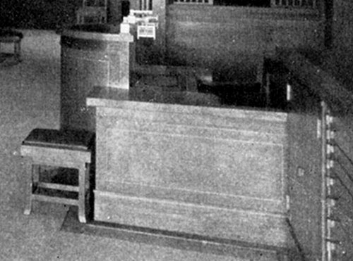
(Adaptation #6) Thurber Art Galleries Composite of Floor Plan and Photographs 1909/2016 (1909 - S.154). Adaptation of the floor plan and historic photographs of the Thurber Art Galleries designed by Frank Lloyd Wright in 1909. The Thurber Art Galleries consisted of the smaller Painting Gallery on the left and the larger Print and Reproduction Gallery on the right. To date, six original photographs have been located. This illustration combines the floor plan and six photographs. Adapted and illustrated by Douglas M. Steiner, 2016, from Wright's original drawing. (S#2016.61.0522) Int1 Historic Photograph #1: Exterior view of Entry from hallway. Glass, an element Wright brilliantly utilized in his designs, engulfed the Entryway of the Thurber Art Galleries. Single stained glass panels adorned either side of the double glass doors in the Entrance. A single circular piece of glass topped the Entrance. Wright used dull grayed white glass, rich yellow and a few small squares of black. All were set in brass leadings of various widths. (S#0094.95.0522) Int2 Historic Photograph #2: View of the smaller Viewing Gallery looking toward the Southwest. The woodwork was of fumed oak, with bronze worked into the grain and inlaid with a line of white holly. The floors were designed especially to reflect the light, composed of white magnasite. Around the edge of the floor was a band of dull yellow-toned magnasite, bringing the golden wall color down into the floor. The two colors were divided by a narrow strip of inlaid brass. The walls of both galleries were covered with cork gilded in a low-toned bronze dadoed by a higher-keyed gilded rough plaster. Each gallery had a skylight, composed of oblong pieces of dull grayed white glass, with smaller oblong pieces of rich yellow and a few small squares of black, set in brass leadings of various widths, and were different in each gallery. The furniture was designed by Wright. (S#0086.05.0911) 2B: Detail: View of the smaller Viewing Gallery. Swinging cork panels are visible on the far left. The furniture was designed by Wright. 2C: Detail of the Viewing Gallery skylight. They were composed of oblong pieces of dull grayed white glass, with smaller oblong pieces of rich yellow and a few small squares of black, all set in brass leadings of various widths. Int3 Historic Photograph #3: View of the smaller Viewing Gallery looking East toward Lake Michigan. The floors were designed especially to reflect the light, composed of white magnasite. Around the edge of the floor was a band of dull yellow-toned magnasite, bringing the golden wall color down into the floor. The two colors were divided by a narrow strip of inlaid brass. The walls of both galleries were covered with cork gilded in a low-toned bronze dadoed by a higher-keyed gilded rough plaster. Each gallery had a skylight, composed of oblong pieces of dull grayed white glass, with smaller oblong pieces of rich yellow and a few small squares of black, set in brass leadings of various widths, and were different in each gallery. The furniture was designed by Wright. (S#0094.17.0911) 3B: Detail view of the smaller Viewing Gallery. Swinging cork panels are visible in the center background. The furniture was designed by Wright. 3C: Detail of the Viewing Gallery skylight. They were composed of oblong pieces of dull grayed white glass, with smaller oblong pieces of rich yellow and a few small squares of black, set in brass leadings of various widths. Int4 Historic Photograph #4: View of the larger Print and Reproduction Gallery looking East toward Lake Michigan. Wright "carefully considers every detail of room size and height, the lighting by day and night, placing of doors and windows, the breaking up of the wall surfaces, the design and use of each piece of furniture..." (I.S.) The built-in portfolio booths were seven and one-half feet high and include portfolio screens, drawer space, tables, desks and seats. There were no fixtures of any sort. Electric lights were placed above the skylights and concealed in the portfolio booths, so that the source of light was hidden, diffused and softened "as to have the effect of daylight". Each gallery had a skylight, composed of oblong pieces of dull grayed white glass, with smaller oblong pieces of rich yellow and a few small squares of black, set in brass leadings of various widths. The furniture was designed by Wright. (S#0094.18.0911) 4B: Detail of the circular desk and Bench Stool with leather covered top. Sides of the desk were angled instead of squared. Drawers under the window table can be seen in the background. 4C: Detail of the seven and one-half foot tall built-in portfolio booths which included portfolio screens, drawer space, tables, desks and seats. Electric lights were concealed in the portfolio booths, so that the source of light was hidden, diffused and softened having the effect of daylight. The furniture was designed by Wright. 4D: Detail of the Print and Reproduction Gallery skylight. They were composed of oblong pieces of dull grayed white glass, with smaller oblong pieces of rich yellow and a few small squares of black, set in brass leadings of various widths. Int5 Historic Photograph #5:View of the built-in portfolio booths in the larger Print and Reproduction Gallery. They were seven and one-half feet high and included viewing spaces, desks that fold up and down, drawer spaces, and innovative viewing portfolio screens that slid up and down within the wall on the right. There were no fixtures of any sort. Electric lights were concealed in the portfolio booths, so that the source of light was hidden and diffused. The furniture was designed by Wright. (S#0086.06.0911) 5B: Detail of the built-in portfolio booths in the larger Print and Reproduction Gallery. They were seven and one-half feet high. On the left there was a viewing space at the top, desks that fold up and down in the center and drawer space on the bottom. Innovative viewing portfolio screens slid up and down within the wall on the right. There were no fixtures of any sort. Electric lights were concealed in the portfolio booths, so that the source of light was hidden and diffused. The furniture was designed by Wright. Int6 Historic Photograph #6: View of the larger Print and Reproduction Gallery looking West. Wright "carefully considers every detail of room size and height, the lighting by day and night, placing of doors and windows, the breaking up of the wall surfaces, the design and use of each piece of furniture..." (I.S.) The built-in portfolio booths were seven and one-half feet high and include portfolio screens, drawer space, tables, desks and seats. There were no fixtures of any sort. There were electric lights placed above the skylights and concealed in the portfolio booths, so that the source of light was hidden, diffused and softened. This larger gallery had two skylights, composed of oblong pieces of dull grayed white glass, with smaller oblong pieces of rich yellow and a few small squares of black, set in brass leadings of various widths. The furniture was designed by Wright. (S#0094.19.0911) Int7 6B: Detail of the built-in portfolio booths in the larger Print and Reproduction Gallery. They were seven and one-half feet high. Innovative viewing portfolio screens slid up and down within the wall on the left. On the right there was a viewing space at the top, desks that fold up and down in the center and drawer space on the bottom. There were no fixtures of any sort. Electric lights were concealed in the portfolio booths, so that the source of light was hidden and diffused. The furniture was designed by Wright. 6C: Detail of the built-in portfolio booths. The desks folded up and down in the center. 6D: Detail of the circular desk. Sides of the desk were angled instead of squared. Behind the deck was the Cashiers' Counter. Between the Cashier's Counter and the circular desk on the right was the Elevator. There were built-in drawers under the table on the far right. 6E: Detail of the Print and Reproduction Gallery skylight. They were composed of oblong pieces of dull grayed white glass, with smaller oblong pieces of rich yellow and a few small squares of black, set in brass leadings of various widths.
ART GLASS & SKYLIGHTS
Wright designed three variations of the Art Glass design for the Thurber Art Galleries. 1: As you approached the Entrance, there were stained glass panels on either side of the double entry doors. 2: The Viewing Gallery contained one large Skylight containing eight panels. 3: The Print and Reproduction Gallery contained two large skylights, each consisting of sixteen panels.
An eye witness description gives us a valuable glimpse into the Thurber Art Galleries. "Each gallery has its skylights, these being composed of oblong pieces of dull grayed white glass, with smaller oblong pieces of rich yellow and a few small squares of black -- all this set in brass leadings of various widths. Thedesigns are different in each gallery and the white note in the floors, while the yellow emphasizes and enriches the general dull gilt color scheme. The artificial light is especially interesting. There are no fixtures of any sort in view, there being a large number of electric lights placed above the skylights and concealed in the architectural construction, so that the source of light is every where hidden and yet the light itself is perfectly diffused and so softened as to have the effect of daylight." International Studio, February, 1910.
Note: These illustrations were adapted from available photographs by Douglas M. Steiner.
ENTRANCE VIEWING GALLERY PRINT & REPRODUCTION GALLERY ENTRANCE
1: (Adaptation #1) Adaptation of the exterior hallway entrance to the Thurber Art Galleries designed by Frank Lloyd Wright in 1909. Wright's design itself becomes the art at the Thurber Art Galleries. Located on the fifth floor of the Annex Building, which is adjacent to the Fine Arts Building on the North side, facing Michigan Avenue. Glass, an element Wright brilliantly utilized in his designs, engulfed the Entryway of the Thurber Art Galleries. Single stained glass panels adorned either side of the double glass doors in the entrance. A single circular piece of glass topped the Entrance. Wright used dull grayed white glass, rich yellow and a few small squares of black. All were set in brass leadings of various widths. Adapted and illustrated by Douglas M. Steiner, 2016. (S#2016.56.0522) 2: (Historic Photograph #1) Exterior view of Entry from hallway. Glass, an element Wright brilliantly utilized in his designs, engulfed the Entryway of the Thurber Art Galleries. Single stained glass panels adorned either side of the double glass doors in the Entrance. A single circular piece of glass topped the Entrance. Wright used dull grayed white glass, rich yellow and a few small squares of black. All were set in brass leadings of various widths. (S#0094.95.0522) VIEWING GALLERY
PRINT & REPRODUCTION GALLERY
2: (Adaptation #4 Complete Skylightl): Adaptation of the ceiling art glass in the Print and Reproduction Gallery designed by Frank Lloyd Wright in 1909. The larger viewing gallery included two large skylights containing 16 panels each. All 32 panels appear to be consistent, except for the four panels above the elevator. They were composed of oblong pieces of dull grayed white glass, with smaller oblong pieces of rich yellow and a few small squares of black, set in brass leadings of various widths. Adapted and illustrated by Douglas M. Steiner, 2016. (S#2016.58.0522) 3: (Historic Photograph #4) View of the larger Print and Reproduction Gallery. There were electric lights placed above the skylights and concealed in the portfolio booths, so that the source of light is hidden, diffused and softened. Each gallery has a skylight, composed of oblong pieces of dull grayed white glass, with smaller oblong pieces of rich yellow and a few small squares of black -- all this set in brass leadings of various widths, and were different in each gallery. (S#0094.18.0911) 3B: Detail of the Print and Reproduction Gallery skylight. They were composed of oblong pieces of dull grayed white glass, with smaller oblong pieces of rich yellow and a few small squares of black, all set in brass leadings of various widths. 4: (Historic Photograph #5) View of the built-in portfolio booths and skylights in the larger Print and Reproduction Gallery. There were no fixtures of any sort. There were electric lights concealed in the portfolio booths and skylights, so that the source of light was hidden and diffused as to have the effect of daylight. (S#0086.06.0911) 5: (Historic Photograph #6) View of the larger Print and Reproduction Gallery looking West. Wright "carefully considers every detail of room size and height, the lighting by day and night, placing of doors and windows..." (I.S.) There were no fixtures of any sort. There were electric lights placed above the skylights and concealed in the portfolio booths, so that the source of light was hidden, diffused and softened "as to have the effect of daylight". This larger gallery had two skylights, composed of oblong pieces of dull grayed white glass, with smaller oblong pieces of rich yellow and a few small squares of black set in brass leadings of various widths. (S#0094.19.0911) 5B: Detail of the Print and Reproduction Gallery skylight. They were composed of oblong pieces of dull grayed white glass, with smaller oblong pieces of rich yellow and a few small squares of black, all set in brass leadings of various widths. FURNITURE
Just after the Thurber Art Galleries opened, the International Studio reviewed Frank Lloyd Wright's work in their extensive February, 1910 exposé. "He carefully considers every detail of room size and height, the lighting by day and night, placing of doors and windows, the breaking up of the wall surfaces, the design and use of each piece of furniture, without losing sight of the minor points of utility..."
One of Wright's Blueprints for the Thurber Art Galleries was published in "Frank Lloyd Wright Monogram, Volume 3". It included a design for the Straight Back Side Chair, a Bench Stool, and a Bench. The Bench does not appear in any of the existing photographs. Of note is the Vase that Wright included, inside, just to the right of the Entrance. It is very similar to the RobieHouse vase, 1906. There are no records or photographs to indicate if the vase was ever produced for the Thurber Art Galleries.
Most likely the wood used to build the chairs matched the wood throughout the galleries. "The woodwork is of fumed oak, with bronze worked into the grain and inlaid with a line of white holly." (International Studio)
There were two additional designs in the smaller Viewing Gallery. An arm chair and a long double sided bench. All furniture was designed with a padded leather seat. Both variations of the chairs and also the long double sided bench included padded leather back panel.
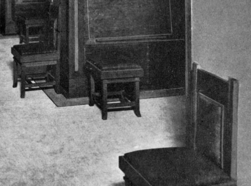
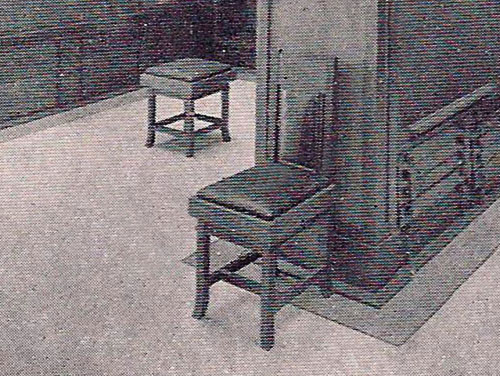
DRAWINGS FURNITURE CHAIRS DESK PRINT FILE DRAWINGS Illustration A: Wright's design for the Straight Back Side Chair. Designed with a padded leather seat and a padded leather back panel. Illustration B: Wright's design for the Bench Stool and Bench. Designed with a padded leather seat. The Bench does not appear in any of the existing photographs. Illustration C: Wright's design of a vase on the interior entrance of the Thurber Art Galleries. Of note is the Vase that Wright included, inside, just to the right of the Entrance. It is very similar to the Robie House vase, 1906. There are no records or photographs to indicate if the vase was ever produced for the Thurber Art Galleries. FURNITURE 1: (Historic Photograph #2) View of the smaller Viewing Gallery looking toward the Southwest. The woodwork was of fumed oak, with bronze worked into the grain and inlaid with a line of white holly. The furniture was designed by Wright. Four examples are seen in this photograph. There are two chair, one is the straight back side chair and the other is an arm chair, one long double sided bench and a stool. (S#0086.05.0911) 1B: Detail of the furniture designed by Wright. Four examples are seen in this photograph. There are two chair, one straight back and one arm chair, one long seat and a stool. 2: (Historic Photograph #3) View of the smaller Viewing Gallery looking East toward Lake Michigan. The furniture was designed by Wright. Two examples are seen in this photograph, the arm chair and long seat. (S#0094.17.0911). 2B: Detail of the furniture designed by Wright. Two examples are seen in this photograph, the arm chair and long seat. 3: (Historic Photograph #4) View of the larger Print and Reproduction Gallery looking East toward Lake Michigan. Wright "carefully considers every detail of room size and height, the lighting by day and night... the design and use of each piece of furniture..." (I.S.) The furniture was designed by Wright. Two examples are seen in this photograph, the straight back chair and the stool. (S#0094.18.0911) 3B: Detail of the furniture designed by Wright. Two examples are seen in this photograph, the straight back chair and the stool.
4: (Historic Photograph #5) View of the built-in portfolio booths in the larger Print and Reproduction Gallery. The furniture was designed by Wright. Two examples are seen in this photograph, the straight back chair and the stool. (S#0086.06.0911) 4B: Detail of the furniture designed by Wright. Two examples are seen in this photograph, the straight back chair and the stool. 5: (Historic Photograph #6) View of the larger Print and Reproduction Gallery looking West. Wright "carefully considers every detail of room size and height, the lighting by day and night the design and use of each piece of furniture..." (I.S.) The furniture was designed by Wright. Two examples are seen in this photograph, the straight back chair and the stool. (S#0094.19.0911) 5B: Detail of the furniture designed by Wright. Two examples are seen in this photograph, the straight back chair and the stool. CHAIR
1) Perspective view of a Thurber Art Galleries oak and leather chair designed by Frank Lloyd Wright in 1909. Three quarter view facing forward and to the right. Constructed of oak, seat and back partially covered in leather. This chair can be seen throughout the Galleries in the original photographs. On June 9, 2019, this chair was sold by Toomey & Company, Oak Park. 35.75 (H) x 15.5 (W) 17.5 (D). (ST#2019.49.0622 ) 2) Front view of a Thurber Art Galleries oak and leather chair designed by Frank Lloyd Wright in 1909. Constructed of oak, seat and back partially covered in leather. This chair can be seen throughout the Galleries in the original photographs. On June 9, 2019, this chair was sold by Toomey & Company, Oak Park. 35.75 (H) x 15.5 (W) 17.5 (D). (ST#2019.50.0622) 3) View of the back of a Thurber Art Galleries oak and leather chair designed by Frank Lloyd Wright in 1909. Constructed of oak, cushion and back partially covered in leather. This chair can be seen throughout the Galleries in the original photographs. On June 9, 2019, this chair was sold by Toomey & Company, Oak Park. 35.75 (H) x 15.5 (W) 17.5 (D). (ST#2019.51.0622) DESK 1: Detail of the circular desk from the West. The woodwork was of fumed oak, with bronze worked into the grain and inlaid with a line of white holly. 2: Detail of the circular desk from the East. The woodwork was of fumed oak, with bronze worked into the grain and inlaid with a line of white holly. PRINT FILE 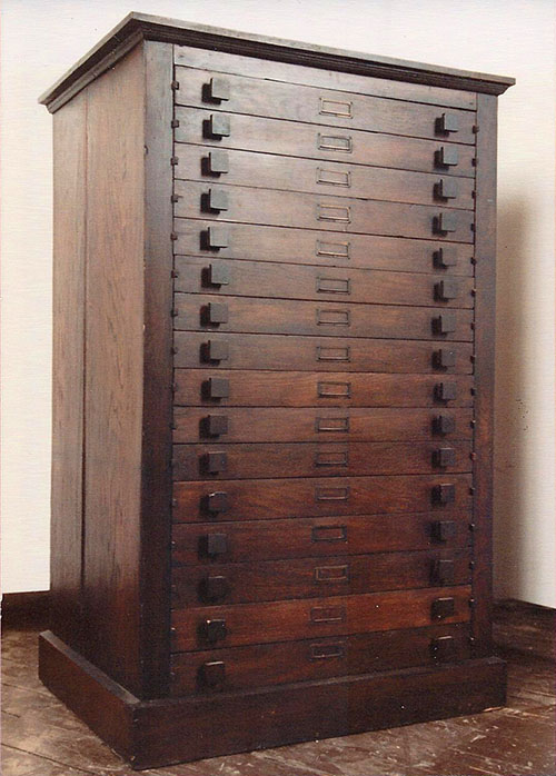
Oak Flat Print File for the W. Scott Thurber Art Galleries, Chicago, designed by Frank Lloyd Wright Circa 1909. Three quarter view facing forward and slightly to the right. Rectangular print file cabinet with overhanging edge and molding around the base. Sixteen narrow, slatted drawers, with square pulls and projecting drawer slides. On December 13-14, 1996, this cabinet sold at Christie’s, New York, Sale 8540, Lot 416, for $23,000 plus buyer’s premium. 53 (H) x 34.25 (W) x 25.25 (D). Acquired from Kelmscott Galleries. (ST#1981.130.0413)

Oak Flat Print File for the W. Scott Thurber Art Galleries, Chicago, designed by Frank Lloyd Wright Circa 1909. Three quarter view facing forward and to the right. Rectangular print file cabinet with overhanging edge and molding around the base. Sixteen narrow, slatted drawers, with square pulls and projecting drawer slides. Hand written on verso: "Frank Lloyd Wright Thurber Galleries." On December 13-14, 1996, this cabinet sold at Christie’s, New York, Sale 8540, Lot 416, for $23,000 plus buyer’s premium. 53 (H) x 34.25 (W) x 25.25 (D). (ST#1981.131.0413)
ADVERTISEMENTS
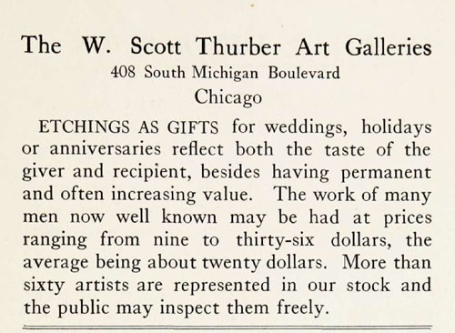
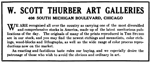
Winfield Scott Thurber began his career as a salesman at the O'Brian Gallery, Chicago's first fine art Gallery. He formed the Thurber Art Gallery in 1880 at 210 Wabash Avenue in downtown Chicago.
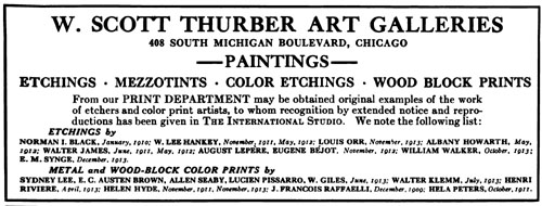
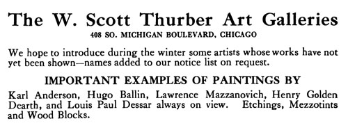
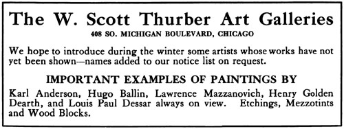
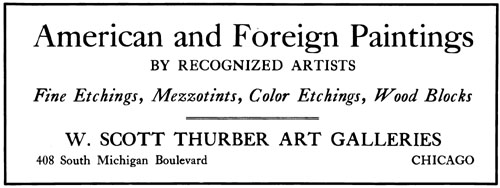
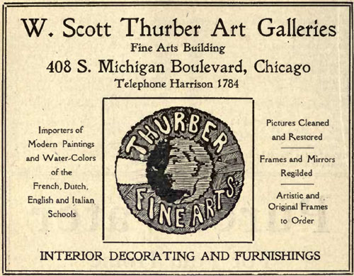
These advertisements are a snap shot in time. A record that gives us a clearer picture and helps define who Thurber Art Galleries was. What types of art were sold. Who did they represent. Who exhibited at Thurber's.
From an ad in 1885, he exhibited Water, Oil and Porcelain Paintings, and "a choice collection of French, English and American publications of Engravings, Etchings, Photogravures, Fine Photographs" and Frames.
In 1909 Thurber commissioned Frank Lloyd Wright to design a Gallery for his new space in the Fine Arts Building, which occupied the entire fifth floor of the adjoining annex on Michigan Avenue. Whether due to the configuration of the space, or intentional, it consisted to two Galleries. The larger Print and Reproduction Gallery, and the smaller Viewing Gallery.
Thurber Art Galleries hosted exhibitions of well know artists. "Connoisseurs and collectors will find carefully selected examples of painting and etchings by the Modern Masters, together with rare and unusual prints, on exhibition in my new galleries.During the winter and spring will be held special exhibitions of paintings by Jules Guerin, Ossip Lind, Birge Harrison..."
In 1911 he held an exhibition for American Artist Jerome Blum and Lawrence Mazzanovich. He gained a reputation dealing mostly in European and American paintings and prints in a conservative style, but Thurber's was also the city's most progressive galleries. He introduced Chicago to the works of the early Modernists. In 1912 he created quite a stir, leaving a lasting mark, by exhibiting the radical abstract work of Arthur Dove.
Thurber was also a dealer for many of the Etchings and Prints that were published in The International Studio.
Advertisements in 1914 publicize The W. Scott Thurber Art Galleries, "Importers of Modern Paintings and Water-Colors of French, Dutch, English and Italian Schools..." "We limit our selections to such examples as conform to the high standard which controls all or our buying. We have fine examples of the rare works of S. Arlent Edwards and Sidney Wilson as well as the best plates of Clifford James, Richard Smythe, Alfred Skrimshire, H. T. Greenhead, Elizebeth Gulland, E. E. Milner, G. G. Stevenson, George P. James, Percy Martindale, John Cother Webb, and the complete work of Fred Millar."
1885 1885: Published in: The Elite Directory and Club List of Chicago. Containing Names and Addresses of Prominent Residents on the most Fashionable Streets of the City and Principal Suburbs, 1885-6. The Elite Publishing Co., Chicago 1885. 1910 1910: Published in: The Chicago Blue Book. Select Names, Chicago and Suburban Towns. For the year ending 1910. Containing the Names and Addresses of Prominent Residents. The Chicago Directory Company, Publishers, Chicago. Copyright 1909. Note: Mr. & Mrs. W. Scott Thurber lived at 3360 South Park Avenue. 203 Michigan was readdress to 408 S. Michigan Boulevard, Chicago. 1910: Published in: The International Studio, February 1910. Published by The John Lane Company, New York. Note: 203 Michigan was readdress to 408 S. Michigan Boulevard, Chicago. 1914: Published in: The Chicago Blue Book. Select Names, Chicago and Suburban Towns. Containing the Names and Addresses of Prominent Residents. The Chicago Directory Company, Publishers, Chicago. Copyright 1913. Note: Mrs. W. Scott Thurber lived at 3360 South Park Avenue. 203 Michigan was readdress to 408 S. Michigan Boulevard, Chicago. 1914: Published in: The International Studio, February 1914. Published by The John Lane Company, New York. 1914: Published in: The International Studio, March 1914. Published by The John Lane Company, New York. 1914: Published in: Poetry, A Magazine of Verse, May 1914. Published by Harriet Monroe, Chicago. 1914: Published in: The International Studio, August 1914. Published by The John Lane Company, New York. 1914: Published in: The International Studio, September 1914. Published by The John Lane Company, New York. 1914: Published in: The International Studio, November 1914. Published by The John Lane Company, New York. 1915: Published in: The International Studio, February 1915. Published by The John Lane Company, New York. 1915: Published in: The Chicago Blue Book. Select Names, Chicago and Suburban Towns. Containing the Names and Addresses of Prominent Residents. The Chicago Directory Company, Publishers, Chicago. Copyright 1914. Note: Mrs. W. Scott Thurber lived at 3360 South Park Avenue. THURBER ART GALLERY SPACE 2014
Thurber Art Galleries, Fine Arts Building Annex, Chicago, Illinois 2014 (1909 - S.154). Set of 18 photographs of the space originally used by the Thurber Art Galleries. Photographed on January 10, 2014. During a trip to Chicago, we decided to visit the Fine Arts Building, locate the space originally used by the Thurber Art Galleries and investigate whether any details remained of Frank Lloyd Wright’s original design. It was on the fifth floor of the Annex Building, which is adjacent to the Fine Arts Building on the North side, facing Michigan Avenue. Where the Fine Arts Building has ten floors, the Annex has five.
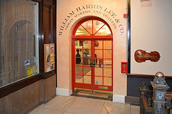
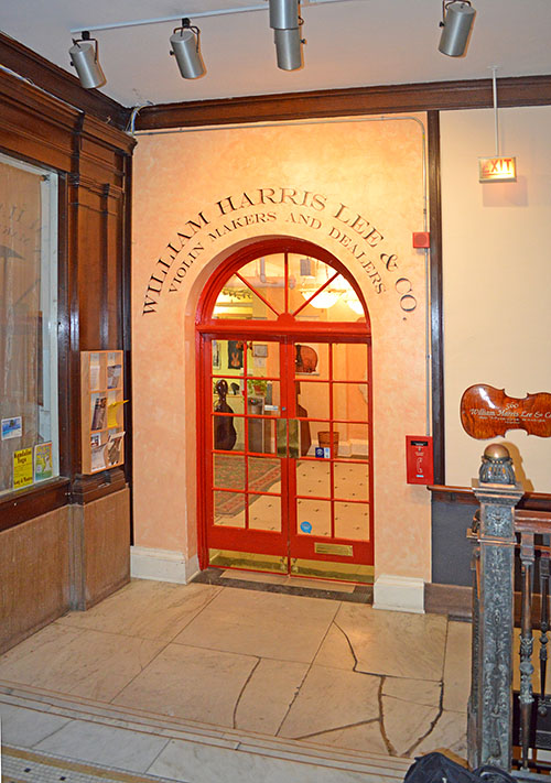
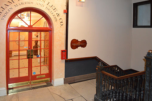
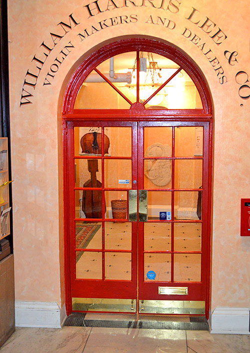
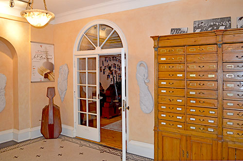
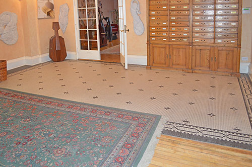
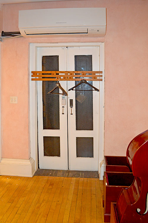
We took the elevator, still manually controlled by an elevator operator, to the fifth floor. The doorway into the fifth floor of the Annex Building is still arched, but Wright’s doors, vertical art-glass panel on either side and trim are gone. The wood paneling on the wall to the left appears to be original. Besides the interior elevator, this arched doorway is the only public entrance to the Annex Building’s fifth floor. So it appears that the Thurber Art Galleries used the entire fifth floor. Wright’s remodel was only for the front half of the space, which included the two galleries. Just inside the entrance, to the immediate left is a hall that lead past the smaller gallery to the back of the space. The back half most likely was for offices and storage, etc.
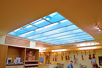
Originally as you entered the Thurber Art Galleries, you were stepping into the larger of the two galleries, the Print and Reproduction Gallery which was about twice the space as the Painting Gallery and extended from the entrance to the windows overlooking Michigan Avenue and Lake Michigan. Immediatelyto the left is a hall that lead past the smaller Gallery to the back of the space. Originally the hallway had a wall that enclosed the Painting Gallery. It has been removed and is now part of what used to be the smaller Painting Gallery.
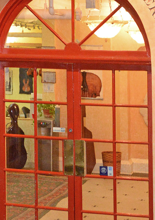
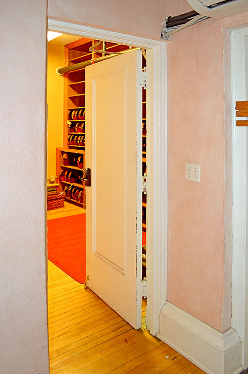
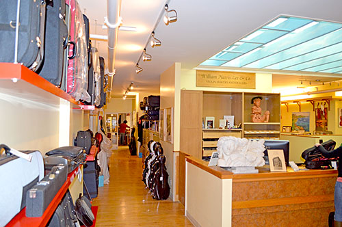
Straight across from the entrance was an area for the cashier. It had design elements that matched the stationary Display Partitions but with balustrades enclosing the upper portion of the enclosure. They were the same height as the Display Partitions so the Gallery was an open area. The cashier’s area is now enclosed by a wall and is a storage area for violins.
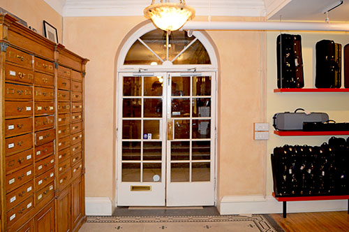
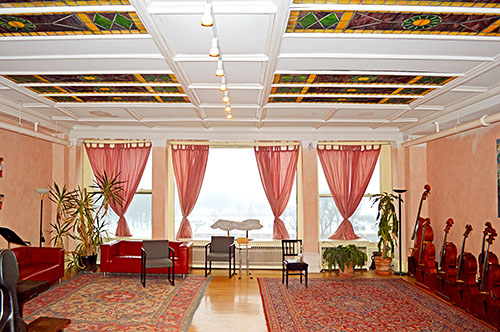
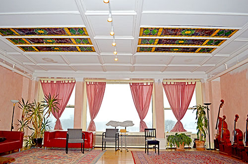
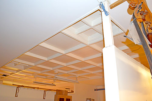
To the right side of the entrance is a wall that now divides the original Print and Reproduction Gallery into two areas. An arched door now leads to the area facing Michigan Avenue. The original art-glass panels in the ceiling have been replace. The Display Partitions were perpendicular to the wall at a height of 7 feet. Above that there was a 4.5" horizontal trim that encompasses the whole room. The foors were covered with white magnasite, a fine cement texture. Around the edge was a band of dull yellow-toned magnasite. The white and yellow were divided by a thin strip of inlaid brass. The floor is now covered in hardwood. The original elevator shaft is still there, but is not functioning. We were not able to clearly identify any details of Frank Lloyd Wright’s original work.
Photographed during a trip to Chicago on January 10, 2014 by Douglas M. Steiner. In an effort to expedite adding these photographs to this website, we have dispensed with a description for each photograph. Set of 18 high res 20 X 13.5 digital images. (ST#2014.55)
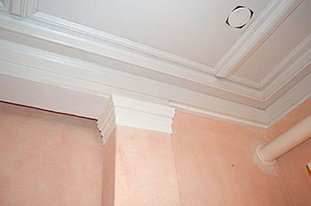
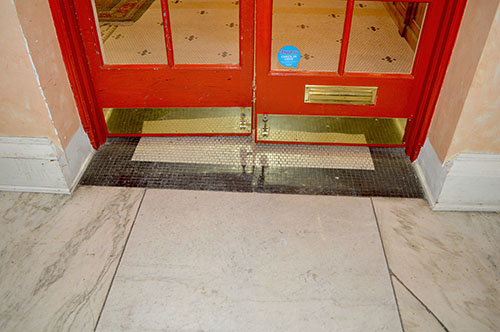
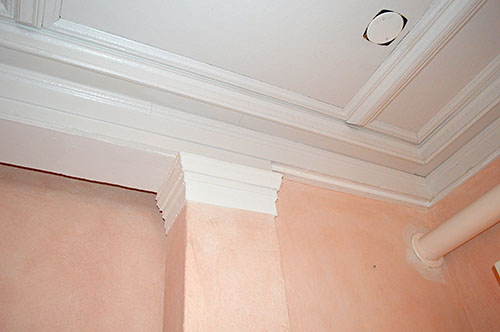
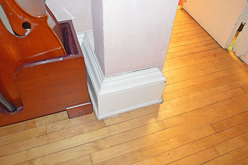
1) Thurber Art Galleries Space, Fine Arts Building Annex, Chicago, Illinois 2014 (1909 - S.154). Entrance to the original space used by the Thurber Art Galleries. 20 x 13.5 high res digital image photographed by Douglas M. Steiner on January 10, 2014. Copyright 2022, Douglas M. Steiner. (ST#2014.55.0522-1) 1B) Detail of the entrance to the original space used by the Thurber Art Galleries. Historic Photograph #1: Exterior view of Entry from hallway. Glass, an element Wright brilliantly utilized in his designs, engulfed the Entryway of the Thurber Art Galleries. Single stained glass panels adorned either side of the double glass doors in the Entrance. A single circular piece of glass topped the Entrance. Wright used dull grayed white glass, rich yellow and a few small squares of black. All were set in brass leadings of various widths. (S#0094.95.0522) 2) Thurber Art Galleries Space, Fine Arts Building Annex, Chicago, Illinois 2014 (1909 - S.154). Entrance to the original space used by the Thurber Art Galleries. 20 x 13.5 high res digital image photographed by Douglas M. Steiner on January 10, 2014. Copyright 2022, Douglas M. Steiner. (ST#2014.55.0522-2) 3) Thurber Art Galleries Space, Fine Arts Building Annex, Chicago, Illinois 2014 (1909 - S.154). Entrance to the original space used by the Thurber Art Galleries. 20 x 13.5 high res digital image photographed by Douglas M. Steiner on January 10, 2014. Copyright 2022, Douglas M. Steiner. (ST#2014.55.0522-3) 4) Thurber Art Galleries Space, Fine Arts Building Annex, Chicago, Illinois 2014 (1909 - S.154). Entrance to the original space used by the Thurber Art Galleries. 20 x 13.5 high res digital image photographed by Douglas M. Steiner on January 10, 2014. Copyright 2022, Douglas M. Steiner. (ST#2014.55.0522-4) 5) Thurber Art Galleries Space, Fine Arts Building Annex, Chicago, Illinois 2014 (1909 - S.154). Entrance to the original space used by the Thurber Art Galleries. 20 x 13.5 high res digital image photographed by Douglas M. Steiner on January 10, 2014. Copyright 2022, Douglas M. Steiner. (ST#2014.55.0522-5) 6) Thurber Art Galleries Space, Fine Arts Building Annex, Chicago, Illinois 2014 (1909 - S.154). Interior view of the entrance to the original space used by the Thurber Art Galleries. 20 x 13.5 high res digital image photographed by Douglas M. Steiner on January 10, 2014. Copyright 2022, Douglas M. Steiner. (ST#2014.55.0522-6) 7) Thurber Art Galleries Space, Fine Arts Building Annex, Chicago, Illinois 2014 (1909 - S.154). A wall was added, dividing the space of the larger of two galleries, the Print and Reproduction Gallery. This doorway leads into the rest of the Print and Reproduction Gallery space. The original elevator shaft is just inside this doorway to the left. 20 x 13.5 high res digital image photographed by Douglas M. Steiner on January 10, 2014. Copyright 2022, Douglas M. Steiner. (ST#2014.55.0522-7) 8) Thurber Art Galleries Space, Fine Arts Building Annex, Chicago, Illinois 2014 (1909 - S.154). A wall was added, dividing the space of the larger of two galleries, the Print and Reproduction Gallery. This doorway leads into the rest of the Print and Reproduction Gallery space. The original elevator shaft is just inside this doorway to the left. 20 x 13.5 high res digital image photographed by Douglas M. Steiner on January 10, 2014. Copyright 2022, Douglas M. Steiner. (ST#2014.55.0522-8) 9) Thurber Art Galleries Space, Fine Arts Building Annex, Chicago, Illinois 2014 (1909 - S.154). View of the space oritinally used by the Thurber Art Galleries for the Pring and Reproduction Gallery, looking toward Lake Michigan. The original art-glass used in the skylight has been removed. 20 x 13.5 high res digital image photographed by Douglas M. Steiner on January 10, 2014. Copyright 2022, Douglas M. Steiner. (ST#2014.55.0522-9) Historic Photograph #4: View of the larger Print and Reproduction Gallery looking East toward Lake Michigan. Wright "carefully considers every detail of room size and height, the lighting by day and night, placing of doors and windows, the breaking up of the wall surfaces, the design and use of each piece of furniture..." (I.S.) The built-in portfolio booths were seven and one-half feet high and include portfolio screens, drawer space, tables, desks and seats. There were no fixtures of any sort. Electric lights were placed above the skylights and concealed in the portfolio booths, so that the source of light was hidden, diffused and softened "as to have the effect of daylight". Each gallery had a skylight, composed of oblong pieces of dull grayed white glass, with smaller oblong pieces of rich yellow and a few small squares of black, set in brass leadings of various widths. The furniture was designed by Wright. (S#0094.18.0911) 10) Thurber Art Galleries Space, Fine Arts Building Annex, Chicago, Illinois 2014 (1909 - S.154). View of the space oritinally used by the Thurber Art Galleries for the Pring and Reproduction Gallery, looking toward Lake Michigan. The original art-glass used in the skylight has been removed. 20 x 13.5 high res digital image photographed by Douglas M. Steiner on January 10, 2014. Copyright 2022, Douglas M. Steiner. (ST#2014.55.0522-10) 11) Thurber Art Galleries Space, Fine Arts Building Annex, Chicago, Illinois 2014 (1909 - S.154). The original elevator shaft in the original Print and Reproduction gallery is there, but not functioning. 20 x 13.5 high res digital image photographed by Douglas M. Steiner on January 10, 2014. Copyright 2022, Douglas M. Steiner. (ST#2014.55.0522-11) 12) Thurber Art Galleries Space, Fine Arts Building Annex, Chicago, Illinois 2014 (1909 - S.154). A room just to the left of the original elevator. Straight across from the entrance was an area for the cashier. It had design elements that matched the stationary Display Partitions but with balustrades enclosing the upper portion of the enclosure. They were the same height as the Display Partitions so the Gallery was an open area. The cashier’s area is now enclosed by a wall and is a storage area for violins. 20 x 13.5 high res digital image photographed by Douglas M. Steiner on January 10, 2014. Copyright 2022, Douglas M. Steiner. (ST#2014.55.0522-12) 13) Thurber Art Galleries Space, Fine Arts Building Annex, Chicago, Illinois 2014 (1909 - S.154). View of the existing trim. The entrance to the violin storage area is to the right. 20 x 13.5 high res digital image photographed by Douglas M. Steiner on January 10, 2014. Copyright 2022, Douglas M. Steiner. (ST#2014.55.0522-13) 14) Thurber Art Galleries Space, Fine Arts Building Annex, Chicago, Illinois 2014 (1909 - S.154). View of the existing trim. The entrance to the violin storage area is to the right. 20 x 13.5 high res digital image photographed by Douglas M. Steiner on January 10, 2014. Copyright 2022, Douglas M. Steiner. (ST#2014.55.0522-14) 15) Thurber Art Galleries Space, Fine Arts Building Annex, Chicago, Illinois 2014 (1909 - S.154). Interior view of the entrance to the original space used by the Thurber Art Galleries. The hall to the right lead past the space of the original Painting Gallery to the rear of the space. 20 x 13.5 high res digital image photographed by Douglas M. Steiner on January 10, 2014. Copyright 2022, Douglas M. Steiner. (ST#2014.55.0522-15) 16) Thurber Art Galleries Space, Fine Arts Building Annex, Chicago, Illinois 2014 (1909 - S.154). The hall to the left lead past the space of the original Painting Gallery (right) to the rear of the space. 20 x 13.5 high res digital image photographed by Douglas M. Steiner on January 10, 2014. Copyright 2022, Douglas M. Steiner. (ST#2014.55.0522-16) 17) Thurber Art Galleries Space, Fine Arts Building Annex, Chicago, Illinois 2014 (1909 - S.154). Skylight over the original space for the Painting Gallery. The art-glass has been remopved. 20 x 13.5 high res digital image photographed by Douglas M. Steiner on January 10, 2014. Copyright 2022, Douglas M. Steiner. (ST#2014.55.0522-17) Historic Photograph #2: View of the smaller Viewing Gallery looking toward the Southwest. The woodwork was of fumed oak, with bronze worked into the grain and inlaid with a line of white holly. The floors were designed especially to reflect the light, composed of white magnasite. Around the edge of the floor was a band of dull yellow-toned magnasite, bringing the golden wall color down into the floor. The two colors were divided by a narrow strip of inlaid brass. The walls of both galleries were covered with cork gilded in a low-toned bronze dadoed by a higher-keyed gilded rough plaster. Each gallery had a skylight, composed of oblong pieces of dull grayed white glass, with smaller oblong pieces of rich yellow and a few small squares of black, set in brass leadings of various widths, and were different in each gallery. The furniture was designed by Wright. (S#0086.05.0911) 17) Thurber Art Galleries Space, Fine Arts Building Annex, Chicago, Illinois 2014 (1909 - S.154). Rear space. 20 x 13.5 high res digital image photographed by Douglas M. Steiner on January 10, 2014. Copyright 2022, Douglas M. Steiner. (ST#2014.55.0522-17) RELATED BOOKS AND ARTICLES
The Caxton Club of Chicago was founded in 1895. "Art Gallery Designed by Frank Lloyd Wright, Architect" International Studio, February, 1910, Pp XCV-XCVI. "The Chicago Blue Book" 1910. Pages 702. Frank Lloyd Wright, Ausgeführte Bauten, Wright, 1911, pages 109. "The Book of Chicagoans" 1911. Pages 671-672. "The Fine Arts Building in Chicago", The International Studio, April 1911, Peattie, Pages XLIV-XLVI.
"Arts and Decoration" December 1916. Pages 103. "Frank Lloyd Wright to 1910", Manson, 1958, Pages 167-168. "Drawings for a Living Architecture", Kaufmann, 1959, page 247. "Fine Arts Building", Pomaranc, 1977, Pages 12.
"The Frank Lloyd Wright Companion", Storrer, 1993, Page 157. "Lost Wright" Lind, 1996, Pages 142-143. "Frank Lloyd Wright Monograph 1907 -1913", Text: Pfeiffer, Bruce Brooks;
Edited and Photographed: Futagawa, Yukio, 1991, Pp 126."The Book of the Fine Arts Building", Peattie, Swan, 2008, Pages 37.
Additional Wright Studies SEE ADDITIONAL WRIGHT STUDIES Frank Lloyd Wright's First Published Article (1898) Photographic Chronology of Frank Lloyd Wright Portraits Frank Lloyd Wright's Nakoma Clubhouse & Sculptures."
A comprehensive study of Wright’s Nakoma Clubhouse
and the Nakoma and Nakomis Sculptures. Now Available.
Limited Edition. More information.Text copyright Douglas M. Steiner, Copyright 2011, 2021.
