|
|
|
Study of Wasmuth Plate XXXVI |
|
|
|
|
|
In 1910 Frank Lloyd Wright
produced the "Ausgeführte
Bauten und Entwürfe von Frank Lloyd Wright" (S.87),
published by Ernst Wasmuth, in Berlin. Each set consisted of
two portfolios with a combined total of one hundred separate
plates (sheets). Printed in German. The complete set
consisted of 72 plates numbered I through LXIV and included
eight with a or b. 28 were tissue overlays and were attached
to the corresponding plates. Each set also included a 31
page introduction, consisting of unbound sheets, folded
once.
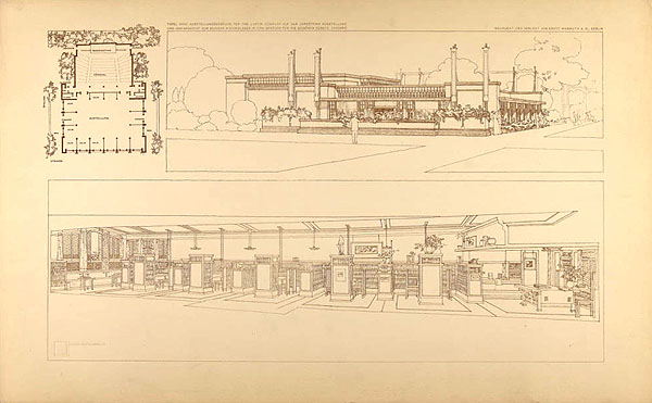
Plate XXXVI (36)
“Exposition building, containing an exhibition-room and lecture-room
for the Larkin Co. at the
Jamestown Exhibition;
and the interior of the Browne’s
Book-Store. A long narrow room in a down-town building converted
into a book-store. The walls and ceiling were re-formed, and
alcoves with chairs and tables provided for the convenience of
customers.” 15.75 x 25.25.
Browne's Bookstore
appeared on the bottom half of
Plate
XXXVI. Although it was published two years
after the completion of the bookstore, minor
details changed from the actual bookstore. Minor
discrepancies could have taken place because
Wright was in Europe when he completed the final
drawings for the
Wasmuth Portfolio.
He may have been using original drawings, and
decided to use alternative conceptual design
ideas. Whatever the reason, this illustration
further explains what little was recorded about
the short life of Browne's Bookstore. |
|
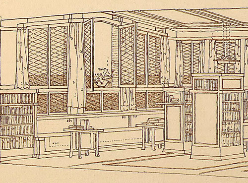
The illustration begins on the left in the seating cove.
"...looking out on the clear waters of Lake Michigan through
an atmosphere" (PW).
Wright utilized the three existing sets of windows, but
changes the shape of the windows as well as the design. The
three side windows are seen on the
right. Browne's was on the left corner on the seventh floor,
when facing the building.
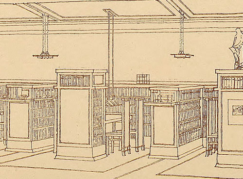
Wright also changed the light fixtures in this illustration.
"By a unique system of
shelf-lighting, the title of every volume from top shelf to
bottom may easily be read, while at the same time the lights
are wholly hidden from the eye (PW). Wright also uniquely angled
the lower shelves, enabling readers ease of visibility
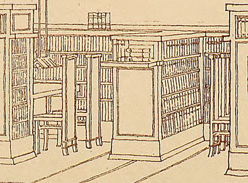
of each title. Space was economized by placing shelves at
right angles to the wall. At the end of the shelf was a
cantilevered shelf, holding additional books or other
decorative items. Between each shelf, was a tier with
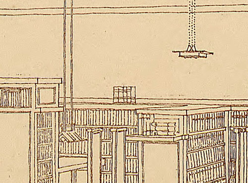
shelving and between the tier and the wall, a long library table, with
a reading lamp suspended from the ceiling and high-backed chairs.
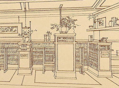
There were a total of five
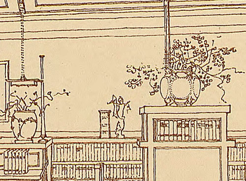
identical coves. There are two decorative items of note in
this illustration. The tall
weed holder and
copper urn.
Wright would often lower the
ceiling, giving the effect of immensity as you moved into
the next room. Wright dropped the ceiling in the space
between the two rooms, while continuing the ceiling above. |
|
|
|
|
|

|
1: Wasmuth
Plate
XXXVI (36)
“Exposition building, containing an exhibition-room and lecture-room
for the Larkin Co. at the
Jamestown Exhibition;
and the interior of the Browne’s
Book-Store. A long narrow room in a down-town building converted
into a book-store. The walls and ceiling were re-formed, and
alcoves with chairs and tables provided for the convenience of
customers.” 15.75 x 25.25. |
|
|
|
|
|
 |
|
Int32:
This detailed illustration of Browne's Bookstore
appeared in 1910 as the bottom half of
Plate
XXXVI. Although it was published two years
after the completion of the bookstore, minor
details changed from the actual bookstore. Minor
discrepancies could have taken place because
Wright was in Europe when he completed the final
drawings for the
Wasmuth Portfolio.
He may have been using original drawings, and
decided to use alternative conceptual design
ideas. Whatever the reason, this illustration
further explains what little was recorded about
the short life of Browne's Bookstore. |
|
|
 |
| 3a: The
illustration begins on the left in the
seating cove. "...looking out on the clear waters of Lake
Michigan through an atmosphere" (PW).
Wright utilized the three existing
sets of windows, but changes the shape of the windows as
well as the design. The three side windows are seen on the
right. Browne's was on the left corner on the seventh floor.
Wright also changed the light fixtures in this illustration. |
| |
 |
|
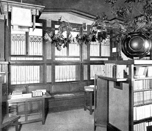
3b: View of
front Cove (Image #3). Built-in seating,
high-backed chairs and tables, stained glass
windows and light fixtures, and a view of Lake
Michigan from these seventh floor windows. Wall
and ceiling trimmings were of quartered oak
throughout. Hidden behind the circular urn on
the right are the additional side windows. |
|
|
 |
|
4a: "By a unique system of
shelf-lighting, the title of every volume from top shelf to
bottom may easily be read, while at the same time the lights
are wholly hidden from the eye (PW). Wright also uniquely angled
the lower shelves, enabling readers ease of visibility
of each title. Space was economized by placing shelves at
right angles to the wall. At the end of the shelf was a
cantilevered shelf, holding additional books or other
decorative items. Between each shelf, was a tier with
shelving and between the tier and the wall, a long library table, with
a reading lamp suspended from the ceiling and high-backed chairs.
The light fixtures were also changed in this illustration. |
| |
 |
| 4b:
Furniture detail. |
| |
 |
| 4c:
Lighting detail. Two variations.
See Lighting details.
The fixture above the table is similar to the double
pedestal Dana
House lamp. |
| |
 |
| |
| 5a:
There were a total of five identical coves, this being the
last one on the right. Two decorative items of note in this
illustration. The tall
weed holder and
copper urn. |
|
|
|
Int5 |
 |
| 5b:
Detail of the tall
weed holder and
copper urn. |
|
W5 |
 |
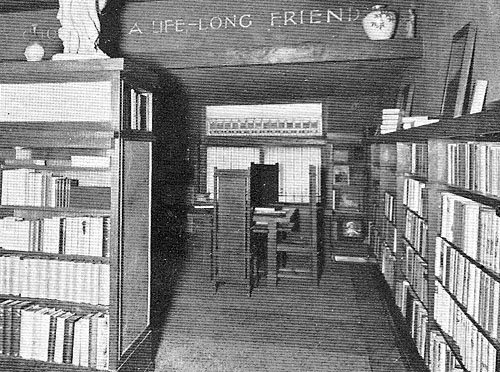
| 6: Wright
would often lower the ceiling, giving the effect of
immensity as you moved into the next room. Wright dropped
the ceiling in the space between the two rooms, while
continuing the ceiling above. See detail of floor plan
below. |
|
Int6 |
 |
| 7a: Small Office. Of note is the
built-in book shelf on the right side of the office opening,
not specified in the floor plan, and not mirrored on the
left side. Curtains are decorative or could be drawn for
privacy. See detail of floor plan and photograph below. |
| |
 |
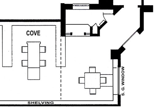
| 7b: Detail of floor plan. Illustrations
Copyright 2011, Douglas M. Steiner. |
| |
 |
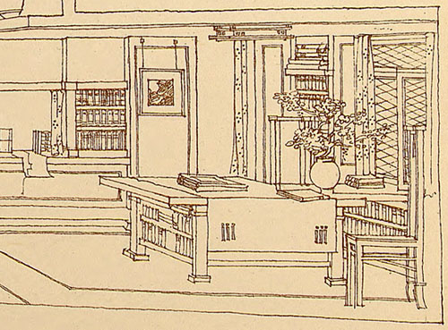
| 8a:
Display table. In reality, this was a square table with four
chairs. Conceptually Wright designed a display table, with
book shelves on one end. He included a connecting shelf
between the table and the window. Of note is the floor plan
(above) that includes the shelf and a chair, possibly
indicating a removable shelf. Wright also changed the window
design as he did in the front windows. |
| |
 |
|
8b: Detail of Image #5. Wright
dropped the ceiling in the space between the two rooms,
while continuing the ceiling above. Conceptually Wright
designed a display table, with book shelves on one end. In
reality, it was a square table with four chairs. |
|
|
|
|
|
|
|
Back |
|
|
|
|
|
|
|
| |
| |
|
BACK TO TOP |
|
|
|
|

CLICK TO ORDER
