[flw/_Private/Navbar Be-mail.htm]
- Wright Studies
Lockridge Medical Clinic, Whitefish, Montana (1958 - S.425)
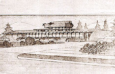
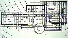
Little has been published concerning this Wright building. Designed in 1958, construction began in 1961 after a Whitefish carpenter visited Taliesin to familiarized himself with Wright’s methods. The 5,000 square foot clinic, designed on a four foot grid, opened in 1963 and functioned as a clinic for one year until Dr. T. L. Lockridge passed away in 1964. The clinic was designed as a medical clinic for Drs. Lockridge, McIntyre and Whalen, upon Dr. Lockridge’s insistence. Rumor has it that the other two doctors were unhappy with the design. One complaint was that the halls were to narrow, not allowing wheelchairs to navigate corners restricting entrance into the examining rooms. This might explain why the clinic vacated the property after Lockridge’s death. First State Bank made major revisions to the building and occupied it until 1980. Since 1980 many other changes have altered the building. In 2002 the building was purchased and remodeled by Frank and Sharon Morrison, and Sean and Diane Frampton for the law firm of Morrison & Frampton. While cost and practicality inhibits restoration to its original design, I appreciate the effort the Morrisons & Framptons have taken to maintain and open the building to visitors.
Historic Images
Designed in 1958, construction began in 1961 after a Whitefish carpenter visited Taliesin to familiarized himself with Wright’s methods. The 5,000 square foot clinic, designed on a four foot grid, opened in 1963 and functioned as a clinic for one year until Dr. T. L. Lockridge passed away in 1964. The clinic was designed as a medical clinic for Drs. Lockridge, McIntyre and Whalen, upon Dr. Lockridge’s insistence.
Text and Photographs by Douglas M. Steiner, Copyright 2008
Photographs By Douglas Steiner, May 2008
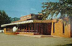
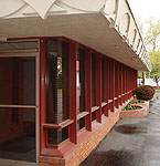
Some of the exterior changes include: The floor to ceiling front door was revised. A second set of front doors on the north side of the waiting room was added. The right side of the roof over the entrance was extended approximately twelve feet or three sections. It used to be the same length as the left side. The bank added addition windows, a drive in and carport roof. At the same time, the square planter was added as well as the corner post support. The upper parapet which was designed for flowers has been capped. The long horizontal front stairs that extended toward the center of the building to the round semi-circular planter were removed. The round semi-circular planter was replaced by two smaller semi-circular planters. The white plastic orb was removed. The trim, which originally was natural Philippine mahogany, had been painted a dark grey has been painted Cherokee red, which is closer to the original intent. A pitched roof was added, I suspect to deal with leakage problems. An addition was added to the back of the building. It was surprising to see the red tile. It appeared in the photographs from the late 1960s. Wright would give these to the buildings that met with his personal approval. The construction was started after his death.
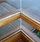
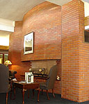
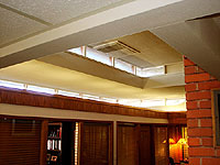
But many of Wright's details remain on the outside. And they are classic Wright details. Mitered glass corners, which appear on the two outside corners of the waiting room as-well-as the clerestory windows. The six inch vertical glass windows just to the right of the exterior and interior front doors, are imbedded in the brick on the right side. These are reminiscent of many Wright buildings. The classic horizontal feel with the vertical windows. Floor to ceiling windows. Decorative cast concrete fascia. The mortar is raked about one-quarter of an inch on the horizontal joints, and flush on the vertical joints. The mortar is tinted pink, almost light purple, consistent with rocks that are native to the area. The interior has suffered extensive remodeling over the past forty five years. Little remains of Wright’s design, but what has remained is classic. The massive brick fireplace is stunning. The double clerestory windows with mitered glass corners opens up what is left of the waiting room.
Text and Photographs by Douglas M. Steiner, Copyright 2008
Books
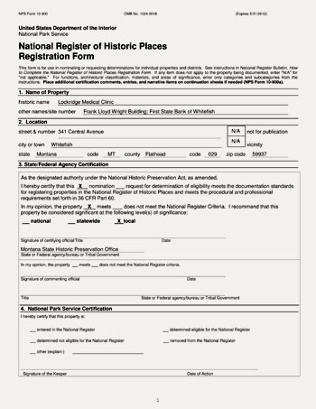
Date: 2012 Title: National Register of Historic Places, Lockridge Medical Clinic (Prepared by the Montana State Historical Preservation Office. Published by the United States Department of the Interior National Park Service, Washington, D.C.)
Author: Greenfield, Mary C.
Description: "The Lockridge Medical Clinic stands as a fine local testament to late Wrightian design. While both the exterior and interior have endured changes over time, the overall design. While both the exterior and interior have endured changes over time, the overall design and character-defining features remain. These include the signature elements for which Wright is known: natural materials, banks of glass, low-slung roof, strong horizontal lines, clerestory windows, and an ‘in-line’ floorplan with a central hearth... The building’s integrity of location and setting remain, and its feeling and association with the Late Wrightian style are sufficient to convey its significance under Criterion C." Our Wright Study on the Lockwood Medical Clinic was cited as a source. Includes twenty photographs and illustrations.
Size: 8.5 x 11
Pages: Pp 37
ST#: 2012.14.1213
